The Checkout block allows you to embed a fully customized WooCommerce checkout form on any SeedProd page. It gives you complete control over the checkout layout and visual style — from field colors, label typography, and row spacing to button design, cart styling, and payment section appearance — so you can create a checkout experience that matches your brand without touching any code.
Use this block to build a streamlined, on-brand checkout page that reduces friction and keeps customers focused on completing their purchase. Once your page is published, simply assign it as your checkout page in WooCommerce settings so customers are directed to it automatically.
Adding the Checkout Block to Your Pages
Follow these steps to add a Checkout block to your SeedProd page:
Step 1: Add the Block
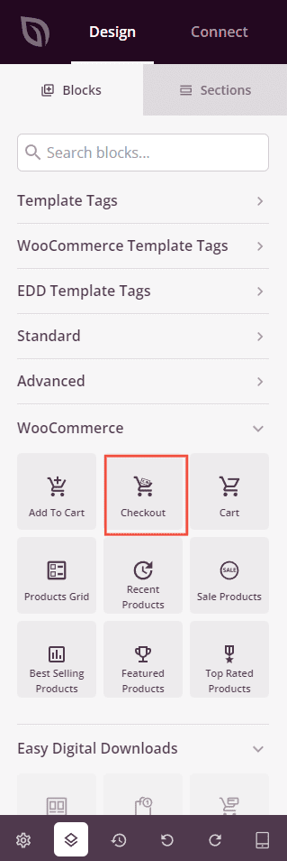
Under Design > Blocks > WooCommerce, drag and drop the Checkout block into the desired section of your page.
Step 2: Configure Style Settings
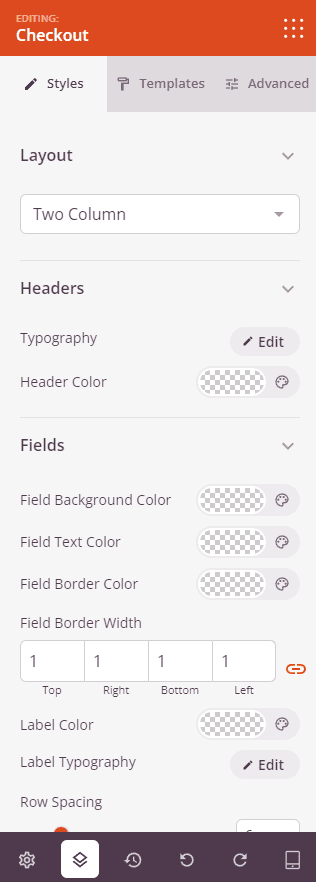
Once added, click on the Checkout block to open its settings. In the Styles tab, settings are organized into seven sections.
Layout:
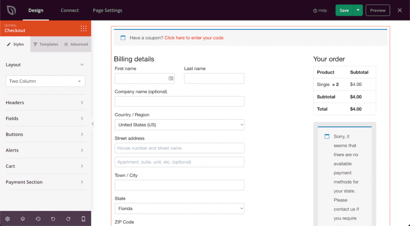
- Layout Columns: Choose between a One Column layout (billing fields and order summary stacked vertically) or a Two Column layout (billing fields on the left, order summary on the right).
Headers:
- Header Color: Set the text color for section headers within the checkout form.
- Typography: Set the font family, size, line height, letter spacing, weight, style, and case for checkout header text.
Fields:
- Field Background Color: Set the background color of checkout input fields.
- Field Text Color: Set the text color inside input fields.
- Field Border Color: Set the border color of input fields.
- Field Border Width: Set the border thickness on each side of input fields.
- Label Color: Set the text color for field labels.
- Label Typography: Set the font family, size, line height, letter spacing, weight, style, and case for field label text.
- Row Spacing: Adjust the vertical spacing between form field rows using a slider (default: 6px).
Buttons:
- Button Style: Choose a visual style for checkout buttons — Flat, 2D, Vintage, Ghost, or Link.
- Button Color: Set the background color of checkout action buttons.
- Border Radius: Adjust the corner roundness of checkout buttons using a slider.
Alerts:
- Info Highlight Color: Set the color used for informational alert messages.
- Error Highlight Color: Set the color used for error alert messages.
- Success Highlight Color: Set the color used for success alert messages.
Cart:
- Cart Border Color: Set the border color of the order summary cart table.
- Cart Border Width: Set the border thickness on each side of the cart table.
- Border Radius: Adjust the corner roundness of the cart table using a slider.
- Background Color: Set the background color of the cart table.
- Text Color: Set the general text color within the cart table.
- Font Family: Choose the font used for cart body text.
- Header Background Color: Set the background color of the cart table header row.
- Header Font Family: Choose the font used for cart header text.
- Header Color: Set the text color of the cart table header row.
Payment Section:
- Background Color: Set the background color of the payment methods section.
- Text Color: Set the text color within the payment methods section.
- Font Family: Choose the font used for payment section text.
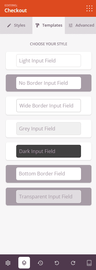
Step 3: Choose a Template
In the Templates tab, you can choose from a collection of pre-designed checkout styles. Each template applies a coordinated set of field, button, and layout styles to your checkout form in one click. Available input field styles include Light, No Border, Wide Border, Inner Shadow, Grey, Dark, Bottom Border, and Transparent.
Step 4: Customize the Design
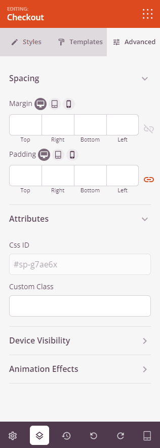
In the Advanced tab, you can further refine the layout and behavior of your Checkout block.
Spacing:
- Margin: Set the outer spacing around the block on all four sides, with independent controls for desktop, tablet, and mobile.
- Padding: Set the inner spacing inside the block wrapper on all four sides, with per-device controls.
Attributes:
- Custom Class: Add one or more custom CSS classes to the block wrapper for targeted styling.
- CSS ID: SeedProd automatically generates a unique CSS ID for this block. You can use it to reference the block in custom CSS or JavaScript.
- Custom Attributes: Add custom HTML attributes to the block wrapper element. Enter each attribute on a new line using the key|value format.
Device Visibility:
- Hide on Desktop: Toggle to hide the block when viewed on desktop screens.
- Hide on Tablet: Toggle to hide the block when viewed on tablet screens.
- Hide on Mobile: Toggle to hide the block when viewed on mobile screens.
Animation Effects:
- Scrolling Effect: Apply a scroll-triggered animation to the block, including Vertical Scroll and Horizontal Scroll options with direction, speed, and viewport offset controls.
- Mouse Effect: Apply a mouse movement-driven parallax effect to the block.
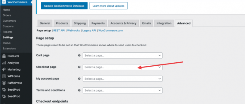
Step 5: Set as Your WooCommerce Checkout Page
After publishing your page, navigate to WooCommerce > Settings > Advanced and set your new SeedProd page as the designated checkout page. This ensures customers are directed to your custom checkout page when they proceed to complete a purchase.
Step 6: Save Your Changes
Once you have finished configuring the Checkout block and customizing its appearance, make sure to save your work.
You’ve successfully added a Checkout block to your page! With layout options, pre-designed templates, and granular control over every visual detail — from field labels and button styles to cart table headers and payment section typography — you can build a checkout experience that feels seamless and professional. Don’t forget to assign the page as your checkout page in WooCommerce settings so your customers always land in the right place.