The Tabs block lets you organize and display content across multiple switchable panels on a single SeedProd page. Instead of stacking all your information vertically, tabs let visitors navigate between sections instantly — keeping your pages clean, focused, and easy to read.
The block supports both horizontal and vertical tab layouts, per-tab icons, rich text content in each panel, and a full suite of styling controls for tab colors, typography, borders, and padding. Pre-built templates let you apply a polished look in one click, while the Advanced tab gives you granular control over every visual detail.
Adding the Tabs Block to Your Pages
Follow these steps to add a Tabs block to your SeedProd page:
Step 1: Add the Block
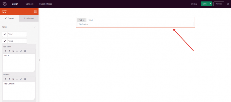
Under Design > Blocks, drag and drop the Tabs block into the desired section of your page.
Step 2: Configure Content Settings
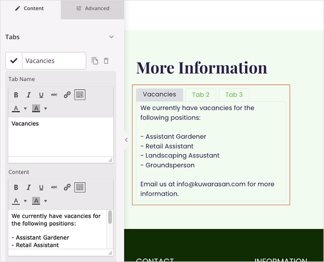
Once added, click on the Tabs block to open its settings. In the Content tab, the Tabs section lets you build and manage all your tab panels:
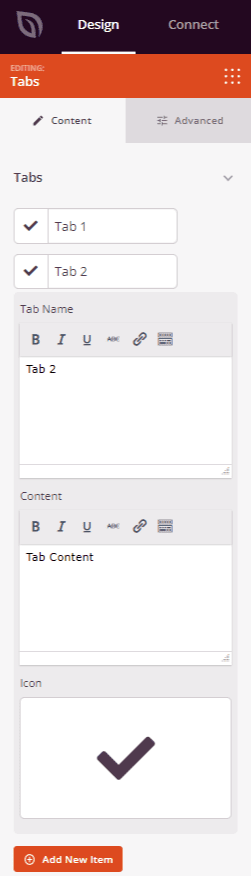
- Tab Name: Enter the label that appears on each tab button. Click any existing tab item to expand it and edit its name, icon, and content.
- Icon: Optionally assign an icon to each tab using the icon picker. The icon appears alongside the tab label in the tab bar.
- Content: Enter the body content for each tab panel. Each tab has its own independent content area.
- Add New Item: Click this button to add additional tab panels to the block.
- Delete / Duplicate: Each tab item includes options to remove it or create a copy with the same settings and content.
- Hide Tab Icon: Toggle this option to show or hide icons across all tabs at once.
- Icon Color: Set a color for all tab icons using the color picker.
- Font Size: Adjust the font size of the tab labels.
- Space Between: Set the gap between adjacent tab buttons.
- Alignment: Choose the horizontal alignment of the tab bar — Left, Center, or Right.
Step 2a: Choose a Template Style
In the Templates tab, you can apply a pre-built visual style to your Tabs block in a single click. Seven preset designs are available, ranging from a minimal default style to more decorative options with borders, backgrounds, and icon treatments. Selecting a template instantly updates the block’s colors, borders, and layout to match the chosen design.
Step 3: Customize the Design
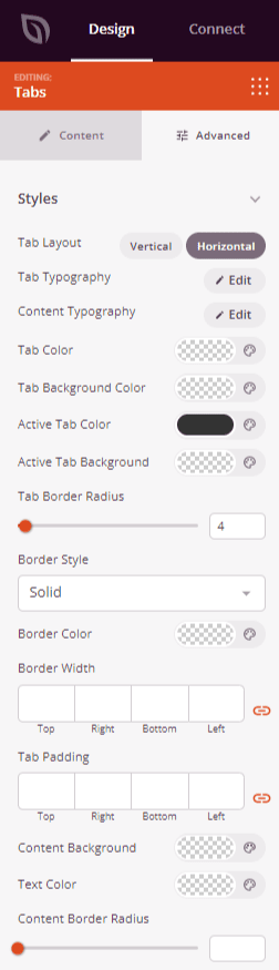
In the Advanced tab, the Styles section gives you full control over the appearance of both the tab bar and the content panels:
Tab Bar Styles:
- Tab Layout: Switch between Horizontal (tabs arranged in a row) and Vertical (tabs stacked in a column alongside the content panel).
- Tab Typography: Set the font, size, weight, style, line height, letter spacing, and letter case for the tab labels.
- Tab Color: Choose the text color for inactive tab labels.
- Tab Background Color: Set the background color for inactive tabs.
- Active Tab Color: Set the text color for the currently selected tab.
- Active Tab Background: Set the background color for the currently selected tab.
- Tab Border Radius: Round the corners of the tab buttons using a 0–100 slider.
- Border Style: Choose a border style for tab buttons — Solid, Dotted, or Dashed.
- Border Width: Set the border thickness on each side (Top, Right, Bottom, Left) of the tab buttons.
- Border Color: Choose the border color for tab buttons.
- Tab Padding: Control the inner spacing (Top, Right, Bottom, Left) inside each tab button.
Content Panel Styles:
- Content Typography: Set the font, size, weight, style, line height, letter spacing, and letter case for the tab panel body text.
- Content Background: Set the background color of the content panel area.
- Text Color: Set the text color inside the content panel.
- Content Border Radius: Round the corners of the content panel box using a 0–100 slider.
- Content Border Style: Choose a border style for the content panel — Solid, Dotted, or Dashed.
- Content Border Color: Choose the border color of the content panel.
- Content Border Width: Set the border thickness on each side (Top, Right, Bottom, Left) of the content panel.
- Content Padding: Control the inner spacing inside the content panel.
- Text Shadow: Add a text shadow to the content panel text, with size presets ranging from None to 2X Large.
The Advanced tab also provides controls for spacing (margin and padding), custom CSS attributes, device visibility, and entrance animations.
Step 4: Save Your Changes
Once you have finished configuring the Tabs block and customizing its appearance, make sure to save your work.
You’ve successfully added a Tabs block to your page! Tabs are a powerful way to present a lot of content in a compact, user-friendly format — keeping visitors engaged without overwhelming them with a long scrolling page. Experiment with horizontal and vertical layouts, template styles, and color combinations to create a tabbed section that fits seamlessly into your design.