The Spacer block lets you add precise amounts of vertical whitespace between other blocks on your SeedProd pages. Rather than relying on margin and padding settings scattered across individual blocks, the Spacer gives you a dedicated, visible element you can place anywhere in your layout to control the breathing room between sections, headings, images, or any other content.
What makes the Spacer block particularly useful is its per-device height control. You can set a different spacer height for desktop, tablet, and mobile screens independently, so your page spacing looks intentional and polished on every device without compromising any other block’s settings.
Adding the Spacer Block to Your Pages
Follow these steps to add a Spacer block to your SeedProd page:
Step 1: Add the Block
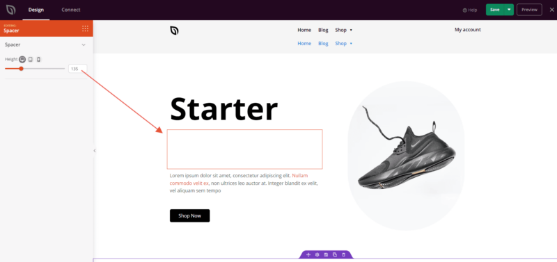
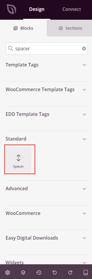
Under Design > Blocks, drag and drop the Spacer block into the desired section of your page between the elements you want to space apart.
Step 2: Configure the Spacer Height
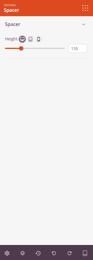
Once added, click on the Spacer block to open its settings. The Spacer section contains a single Height control with per-device sliders so you can define exactly how much space appears on each screen size.
- Height (Desktop): Set the spacer height for desktop screens using the slider (0–500px). Click the desktop icon to edit this value.
- Height (Tablet): Set the spacer height for tablet screens using the slider (0–500px). Click the tablet icon to switch to tablet editing mode and adjust the value independently from desktop.
- Height (Mobile): Set the spacer height for mobile screens using the slider (0–500px). Click the mobile icon to switch to mobile editing mode and adjust the value independently from desktop and tablet.
Step 3: Save Your Changes
Once you have finished configuring the Spacer block, make sure to save your work.
You’ve successfully added a Spacer block to your page! Use it wherever your layout needs a controlled gap — between a hero section and your first content row, between a heading and an image, or anywhere the default spacing between blocks doesn’t match your design. With independent height values for desktop, tablet, and mobile, you can fine-tune your page’s vertical rhythm across every device without touching any other block’s settings.