The Social Profiles block lets you display a row of linked social media icons on any SeedProd page. Each icon links directly to your profile on a supported platform, giving visitors a quick way to follow or connect with you across the web. The block comes with 12 pre-built style templates and supports over 20 platforms including Facebook, X (Twitter), Instagram, LinkedIn, YouTube, TikTok, Pinterest, Discord, WhatsApp, and more.
Beyond the ready-made templates, you have full control over icon style, size, color, spacing, and border radius. Each social profile entry can be reordered by drag and drop, duplicated, or removed independently, making it easy to maintain exactly the platforms you want to highlight. A Custom option also lets you add any icon from SeedProd’s icon library with its own color and URL for platforms not on the built-in list.
Adding the Social Profiles Block to Your Pages
Follow these steps to add a Social Profiles block to your SeedProd page:
Step 1: Add the Block
Under Design > Blocks, drag and drop the Social Profiles block into the desired section of your page.
Step 2: Configure Content Settings
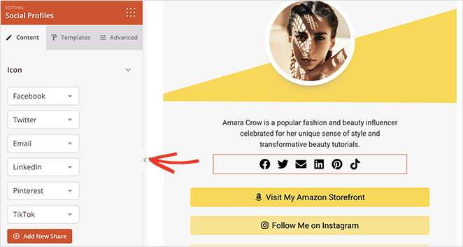
Once added, click on the Social Profiles block to open its settings. In the Content tab, the Icon section lets you manage your social profile list and configure display options.
Managing Social Profiles:
- Profile Type: Use the dropdown next to each entry to select the social platform. Supported platforms include Discord, Email, Facebook, Facebook Messenger, GitHub, IMDb, Instagram, LinkedIn, Medium, Phone, Pinterest, RSS, Slack, Snapchat, SoundCloud, Telegram, TikTok, X (Twitter), Vimeo, Weibo, WhatsApp, WordPress, YouTube, and Custom.
- URL: Click the settings gear icon on any entry to expand its URL field. Enter the full link to your profile page (include
https://). For Email entries, enter your email address. For Custom entries, you can also pick any icon from the icon library and set a custom color. - Reorder: Drag entries up or down using the drag handle (arrows icon) to change the display order of icons.
- Duplicate / Delete: Hover over any entry to reveal the Duplicate and Delete buttons for quick management.
- Add New Share: Click the + Add New Share button at the bottom of the list to add another social profile entry.
Display Options:
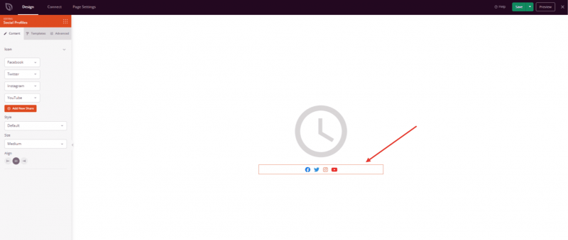
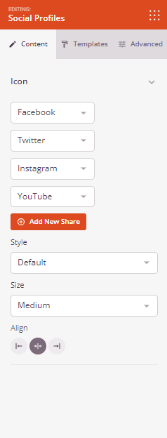
- Style: Choose between Default (icon only, no background) and Stacked (icon on a colored background square).
- Size: Set the overall icon size — Small, Medium, or Large.
- Alignment: Set the horizontal alignment of the icon row — Left, Center, or Right. Supports per-device alignment for desktop, tablet, and mobile.
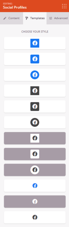
Step 2a: Choose a Template Style
In the Templates tab, you can apply a pre-built icon style to your Social Profiles block with a single click. There are 12 style templates available, ranging from flat square icons to rounded, pill-shaped, and dark-themed variations. Selecting a template instantly updates the block’s icon style, size, border radius, and color settings to match the chosen design.
Step 3: Customize the Design
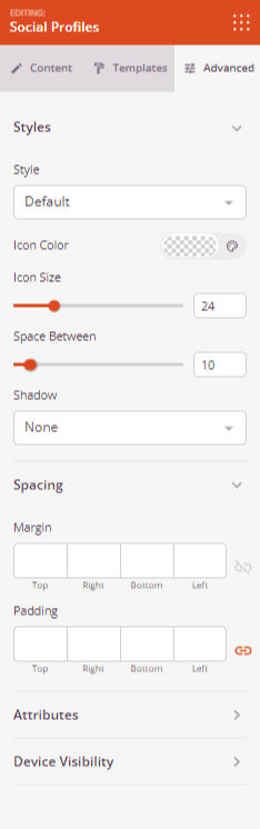
In the Advanced tab, you can fine-tune the visual appearance of your Social Profiles block.
Styles:
- Style: Switch between Default and Stacked icon styles (same as the Content tab setting).
- Icon Color: Set a single color applied to all icons in the block, overriding each platform’s default brand color.
- Icon Size: Fine-tune the icon size in pixels using the slider (0–100px).
- Border Radius: When using the Stacked style, adjust the corner radius of the icon background squares to create square, rounded, or fully circular shapes (0–100px).
- Icon Padding: When using the Stacked style, control the spacing between the icon and the edge of its background container (0–100px).
- Space Between: Set the horizontal gap between each icon in the row (0–100px).
- Shadow: Add a shadow effect to the icon elements. Choose from preset sizes — None, Hairline, Small, Medium, Large, X Large, and 2X Large.
Spacing:
- Margin: Control the outer spacing around your Social Profiles block (Top, Right, Bottom, Left). Supports per-device values for desktop, tablet, and mobile.
- Padding: Adjust the inner spacing within your Social Profiles block (Top, Right, Bottom, Left). Supports per-device values for desktop, tablet, and mobile.
Attributes:
- CSS ID: Displays the auto-generated unique identifier for your Social Profiles block. This ID is created automatically by SeedProd and can be used for custom styling or JavaScript targeting.
- Custom Class: Add custom CSS classes to apply specific styles from your theme or custom CSS.
- Custom Attributes: Add any HTML attributes to the block wrapper element. Enter each attribute on a new line using the format: attribute-name|value (e.g., data-section|social).
Device Visibility:
- Hide on Desktop: Hide the Social Profiles block on desktop screens.
- Hide on Tablet: Hide the Social Profiles block on tablet devices.
- Hide on Mobile: Hide the Social Profiles block on mobile devices.
Animation Effects:
- Entrance Animation: Choose from various animation effects that play when the Social Profiles block scrolls into view. Options include Bounce, Fade In, Zoom In, Rotate In, and many more.
Step 4: Save Your Changes
Once you have finished configuring the Social Profiles block and customizing its appearance, make sure to save your work.
You’ve successfully added a Social Profiles block to your page! With support for over 20 platforms, 12 ready-made style templates, and full control over icon size, color, spacing, and border radius, this block makes it easy to build a professional social media strip that fits any design. Experiment with the Default and Stacked styles, explore the template presets, and use the drag-and-drop reordering to arrange your profiles exactly the way you want them.