The Products Related block allows you to display related products on your WooCommerce Single Product templates. WooCommerce automatically determines related products based on the categories and tags assigned to each product, so placing a product in a category or adding a tag ensures that only products from the same category or tag group are shown.
This block is designed exclusively for use inside Single Product templates. You can control how many products appear, how they are sorted, and fully customize the grid’s typography, button styles, and image presentation from the Advanced tab.
Adding the Products Related Block to Your Pages
Follow these steps to add a Products Related block to your SeedProd Single Product template:
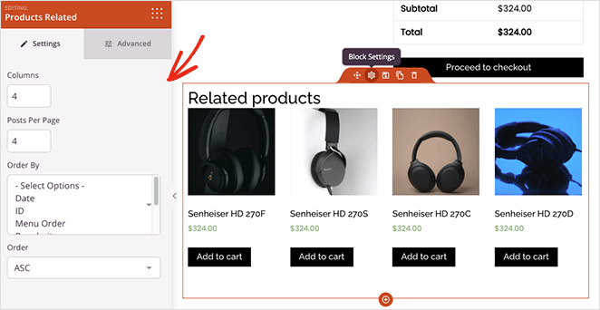
Step 1: Add the Block
Under Design > Blocks > WooCommerce Template Tags, drag and drop the Products Related block into the desired section of your Single Product template.
Step 2: Configure Settings
Once added, click on the Products Related block to open its settings. In the Settings tab, you will find the following options:
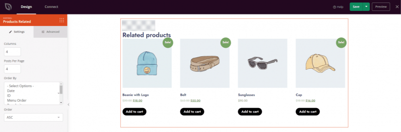
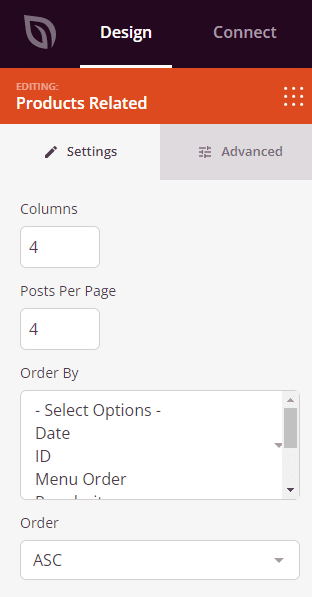
- Columns: Set the number of product columns to display in the related products grid.
- Posts Per Page: Set the maximum number of related products to display.
- Order By: Set how related products are sorted — by Date, ID, Menu Order, Popularity, Random, Rating, or Title.
- Order: Set the sort direction — ASC (ascending) or DESC (descending).
Step 3: Customize the Design
In the Advanced tab, you can customize the visual appearance of your Products Related block. Settings are organized into three sections.
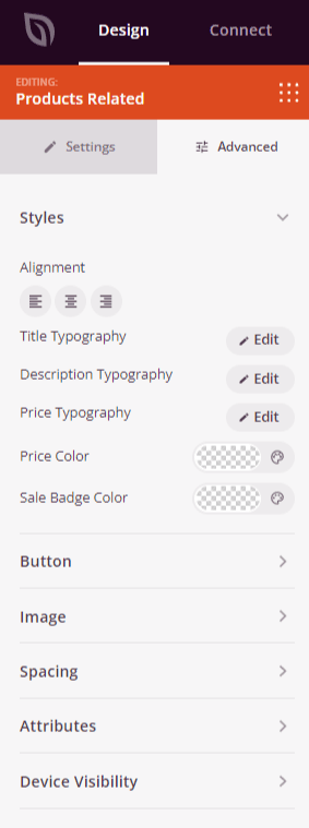
Styles:
- Alignment: Set the horizontal alignment of the related products grid — Left, Center, or Right — with per-device controls for desktop, tablet, and mobile.
- Title Typography: Set the font family, size, line height, letter spacing, weight, style, and case for product title text.
- Description Typography: Set the font family, size, line height, letter spacing, weight, style, and case for product description text.
- Price Typography: Set the font family, size, line height, letter spacing, weight, style, and case for product price text.
- Price Color: Set the color of the regular product price.
- Sale Color: Set the color of the sale price when a product is discounted.
Button:
- Button Style: Choose a visual style for the Add to Cart button — Flat, 2D, Vintage, Ghost, or Link.
- Button Color: Set the background color of the Add to Cart button.
- Button Typography: Set the font family, size, line height, letter spacing, weight, style, and case for button text.
- Button Size: Choose a preset button size — Small, Medium, Large, X Large, or 2X Large.
- Border Radius: Adjust the corner roundness of the Add to Cart button using a slider.
Image:
- Shadow: Apply a shadow to product images using preset sizes — None, Hairline, Small, Medium, Large, X Large, 2X Large, or Bottom Drop Shadow.
- Border Style: Set the border style of product images — Solid, Dotted, or Dashed.
- Image Border Color: Set the color of the product image border.
- Image Border Width: Set the border thickness on each side (Top, Right, Bottom, Left) of the product image.
- Image Whitespace Padding: Add inner padding around product images within their border.
Spacing:
- Margin: Set the outer spacing around the block on all four sides, with independent controls for desktop, tablet, and mobile.
- Padding: Set the inner spacing inside the block wrapper on all four sides, with per-device controls.
Attributes:
- Custom Class: Add one or more custom CSS classes to the block wrapper for targeted styling.
- CSS ID: SeedProd automatically generates a unique CSS ID for this block. You can use it to reference the block in custom CSS or JavaScript.
- Custom Attributes: Add custom HTML attributes to the block wrapper element. Enter each attribute on a new line using the key|value format.
Device Visibility:
- Hide on Desktop: Toggle to hide the block when viewed on desktop screens.
- Hide on Tablet: Toggle to hide the block when viewed on tablet screens.
- Hide on Mobile: Toggle to hide the block when viewed on mobile screens.
Animation Effects:
- Scrolling Effect: Apply a scroll-triggered animation to the block, including Vertical Scroll and Horizontal Scroll options with direction, speed, and viewport offset controls.
- Mouse Effect: Apply a mouse movement-driven parallax effect to the block.
Step 4: Save Your Changes
Once you have finished configuring the Products Related block and customizing its appearance, make sure to save your work.
You’ve successfully added a Products Related block to your Single Product template! Showing related products is a proven way to increase average order value and keep customers exploring your catalog. Make sure your products are organized with consistent categories and tags so WooCommerce can surface the most relevant recommendations for each item.