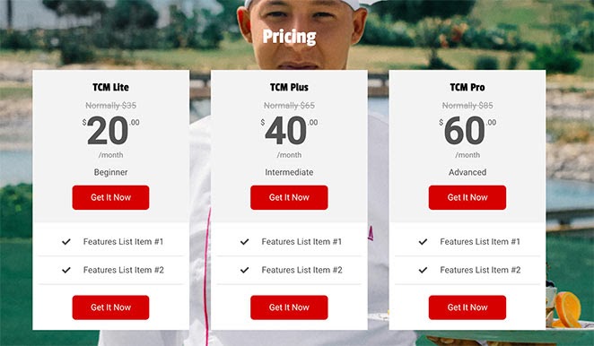
The Pricing Table block allows you to create visually appealing and advanced pricing tables to showcase your products or services. Whether you’re presenting subscription plans, service tiers, or product packages, this block gives you complete control over how each plan is displayed.
Each pricing table includes a plan name, price with currency symbol, billing period, description, optional regular/original price, a features list, and up to two call-to-action buttons. Use multiple Pricing Table blocks side by side to create a full pricing section that helps visitors compare plans and make a purchase decision.
Adding the Pricing Table Block to Your Pages
Follow these steps to add a Pricing Table block to your SeedProd page:
Step 1: Add the Block
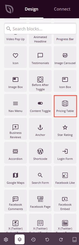
Under Design > Blocks, drag and drop the Pricing Table block into the desired section of your page.
Step 2: Configure Content Settings
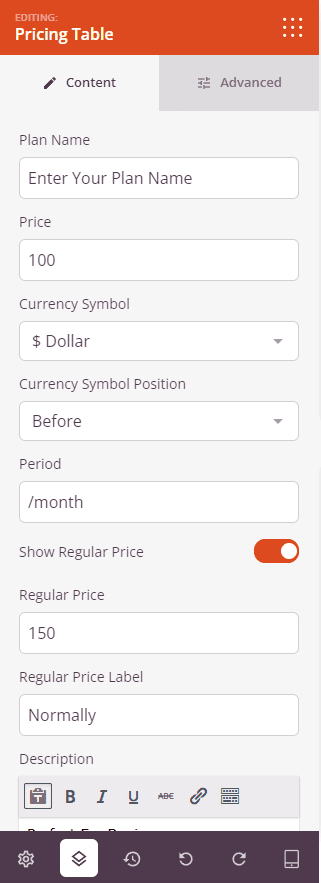
Once added, click on the Pricing Table block to open its settings. The Content tab is organized into a main settings area for the plan header and buttons, followed by a Features List section for the plan’s feature items.
Plan Header:
- Plan Name: Enter the name of your pricing plan (e.g., Basic, Pro, Enterprise). This appears prominently at the top of the pricing table.
- Price: Enter the numeric price for the plan (e.g., 29). The currency symbol and period are set separately.
- Currency Symbol: Choose the currency symbol to display from a dropdown of common currencies including Dollar ($), Euro (€), Pound (£), Rupee (₹), Yen (¥), and many more. Select Custom to enter any symbol you need in the Custom Symbol field.
- Currency Symbol Position: Set whether the currency symbol appears Before or After the price number.
- Period: Enter the billing period text that appears after the price (e.g., /month, /year, /user). Leave blank to show the price without a period.
- Show Regular Price: Toggle on to display an original or regular price above the current price — useful for showing a discounted rate. When enabled, enter the Regular Price amount and a Regular Price Label (e.g., “Normally”) that precedes it.
- Description: Enter a short tagline or description for the plan (e.g., “Perfect For Beginners”). Supports basic rich text formatting including bold, italic, underline, and links.
Buttons:
- Show Top Button: Toggle on to display a call-to-action button above the features list. When enabled, enter the Top Button Text, Top Button Link, and optionally check Open In New Window for the link. Set the Top Button Border Radius (0–100px) to control the button’s corner rounding.
- Show Bottom Button: Toggle on to display a second call-to-action button below the features list. When enabled, enter the Bottom Button Text, Bottom Button Link, and optionally check Open In New Window. Set the Bottom Button Border Radius to match your design.
Features List:
- Features items: Each feature appears as a draggable row. Drag items to reorder them. Hover over an item to reveal duplicate and delete buttons. Click an item’s text to expand its individual settings.
- Text: Enter the feature text for the item. Supports basic rich text formatting including bold, italic, underline, and links.
- Icon: Choose an icon to display alongside the feature text using the icon picker. The default is a checkmark icon.
- Add New Item: Click the button at the bottom of the features list to add a new feature row.
Step 3: Customize the Design
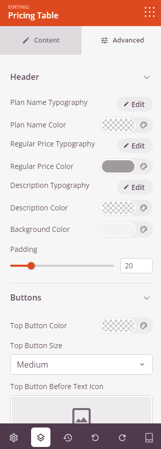
In the Advanced tab, you can fine-tune the typography, colors, buttons, and overall appearance of your Pricing Table. The Advanced tab is organized into five style sections followed by the standard spacing and visibility controls.
Header:
- Plan Name Typography: Set the font family, size, weight, and style for the plan name text.
- Plan Name Color: Set the color of the plan name text.
- Regular Price Typography: Set the typography for the regular (original) price text when the Show Regular Price option is enabled.
- Regular Price Color: Set the color of the regular price text.
- Description Typography: Set the typography for the plan description text.
- Description Color: Set the color of the description text.
- Background Color: Set the background color of the header area (plan name, price, and description).
- Padding: Set the inner spacing (0–100px) within the header area.
Buttons:
- Top Button Color: Set the background color of the top call-to-action button.
- Top Button Size: Choose the size of the top button — Small, Medium, Large, X Large, or 2X Large.
- Top Button Before Text Icon: Add an icon that appears before the button label text using the icon picker.
- Top Button After Text Icon: Add an icon that appears after the button label text using the icon picker.
- Bottom Button Color: Set the background color of the bottom call-to-action button.
- Bottom Button Size: Choose the size of the bottom button — Small, Medium, Large, X Large, or 2X Large.
- Bottom Button Before Text Icon: Add an icon that appears before the bottom button label text.
- Bottom Button After Text Icon: Add an icon that appears after the bottom button label text.
Price:
- Price Typography: Set the font family, size, weight, and style for the main price number.
- Price Color: Set the color of the main price number.
- Price Superscript Typography: Set the typography for the currency symbol when displayed as a superscript alongside the price.
- Price Superscript Top: Adjust the vertical position of the currency symbol superscript relative to the price number.
Features List:
- Features List Typography: Set the font family, size, weight, and style for all feature item text.
- Features List Color: Set the text color of the feature items.
- Icon Color: Set the color of the icons displayed next to each feature item.
- Space Between: Set the spacing (1–100px) between each feature item in the list.
- Alignment: Set the horizontal alignment of the features list — Left, Center, or Right.
- Background Color: Set a background color for the features list area.
- Padding: Set the inner spacing (0–100px) within the features list area.
Block:
- Border Radius: Set the corner rounding of the entire pricing table block (0–100px).
- Border Style: Set the border style for the block — Solid, Dotted, or Dashed.
- Border Color: Set the color of the block border.
- Border Width: Set the border thickness per side (Top, Right, Bottom, Left). Toggle the sync icon to apply the same value to all sides at once.
Spacing:
- Margin: Control the outer spacing around your Pricing Table block (Top, Right, Bottom, Left). This determines how much space appears between the table and surrounding elements on the page.
- Padding: Adjust the inner spacing within your Pricing Table block (Top, Right, Bottom, Left). This creates breathing room between the table content and the block edges.
Attributes:
- CSS ID: Displays the auto-generated unique identifier for your Pricing Table block. This ID is created automatically by SeedProd for custom styling or JavaScript targeting.
- Custom Class: Add custom CSS classes to apply specific styles from your theme or custom CSS.
- Custom Attributes: Add any HTML attributes to the block wrapper element. Enter each attribute on a new line using the format: attribute-name|value (e.g., data-plan|pro).
Device Visibility:
- Hide on Desktop: Hide the Pricing Table block on desktop screens.
- Hide on Tablet: Hide the Pricing Table block on tablet devices.
- Hide on Mobile: Hide the Pricing Table block on mobile devices.
Animation Effects:
- Entrance Animation: Choose from various animation effects that play when the Pricing Table scrolls into view. Options include Bounce, Fade In, Zoom In, Rotate In, and many more. Adding a subtle animation can help draw attention to your pricing plans at the right moment.
Step 4: Save Your Changes
Once you have finished configuring the Pricing Table block and customizing its appearance, make sure to save your work.
You’ve successfully added a Pricing Table block to your page! Place multiple Pricing Table blocks side by side in a column layout to create a complete pricing section that lets visitors compare plans at a glance. Experiment with header backgrounds, button colors, and typography to build a pricing section that matches your brand and drives conversions.