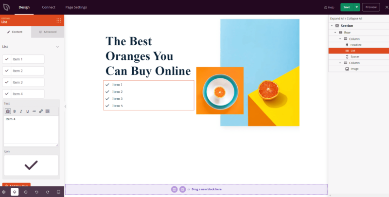
The List block allows you to create icon-based lists to highlight features, benefits, or any set of items on your page. Each list item combines a customizable icon with rich text, giving you full control over how your content is presented.
Whether you’re showcasing product features, summarizing key points, or building a comparison list, the List block makes it easy to create visually engaging lists that match your brand — without any coding.
Adding the List Block to Your Pages
Follow these steps to add a List block to your SeedProd page:
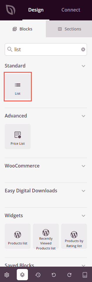
Step 1: Add the Block
Under Design > Blocks, drag and drop the List block into the desired section of your page.
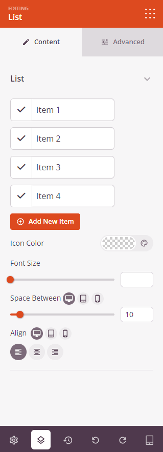
Step 2: Configure Content Settings
Once added, click on the List block to open its settings. In the Content tab, build your list items and configure the overall appearance.
List:
- Items: Each list item has an icon and a text field. Click an item to expand its settings and edit the Text (using the rich text editor for bold, italic, links, and more) and choose an Icon using the icon picker. You can drag items to reorder them, duplicate an item, or delete it.
- Add New Item: Click this button to add another item to your list.
- Icon Color: Set the color applied to all icons in the list.
- Font Size: Control the text size for all list items, from 10px to 72px.
- Space Between: Adjust the spacing between list items. Supports per-device values for desktop, tablet, and mobile.
- Alignment: Set the horizontal alignment of the list — Left, Center, or Right. Supports per-device alignment.
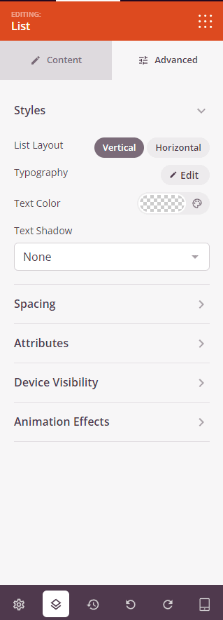
Step 3: Customize the Design
In the Advanced tab, you can customize the visual appearance of your List block.
Styles:
- List Layout: Choose between Vertical (items stacked on top of each other) or Horizontal (items displayed in a row side by side).
- Typography: Customize the font family, weight, size, line height, letter spacing, and text transform for your list text.
- Text Color: Set the color of the list item text.
- Text Shadow: Add a shadow to your list text. Choose from None, Hairline, Small, Medium, Large, X Large, or 2X Large.
Spacing:
- Margin: Control the outer spacing around your List block (Top, Right, Bottom, Left).
- Padding: Adjust the inner spacing within your List block (Top, Right, Bottom, Left). Supports per-device values for desktop, tablet, and mobile.
Attributes:
- CSS ID: Displays the auto-generated unique identifier for your List block, created automatically by SeedProd for custom styling or JavaScript targeting.
- Custom Class: Add custom CSS classes to apply specific styles from your theme or custom CSS.
- Custom Attributes: Add any HTML attributes to the list wrapper element. Enter each attribute on a new line using the format: attribute-name|value.
Device Visibility:
- Hide on Desktop: Hide the List block on desktop screens.
- Hide on Tablet: Hide the List block on tablet devices.
- Hide on Mobile: Hide the List block on mobile devices.
Animation Effects:
- Entrance Animation: Choose an animation effect that plays when the List block scrolls into view, such as Bounce, Fade In, Zoom In, Rotate In, and many more.
Step 4: Save Your Changes
Once you have finished configuring the List block and customizing its appearance, make sure to save your work.
You’ve successfully added a List block to your page! The List block is a versatile way to present features, benefits, or any set of points in a visually compelling format. Experiment with different icons, layouts, colors, and typography to create a list that fits your page perfectly.