The Icon block allows you to add a single scalable icon to any SeedProd page. With access to thousands of Font Awesome icons, you can quickly place visual symbols that support your content — whether that’s a social media icon, a directional arrow, a feature indicator, or a decorative accent.
Each icon can be sized, colored, aligned, and optionally linked to any URL, making it a versatile building block for buttons, feature lists, calls to action, and more.
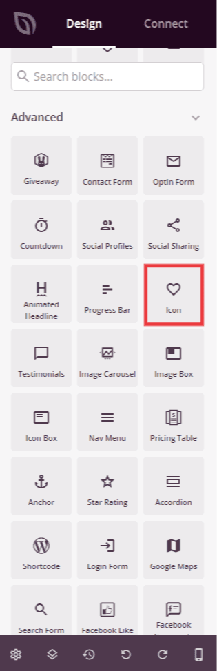
Adding the Icon Block to Your Pages
Follow these steps to add an Icon block to your SeedProd page:
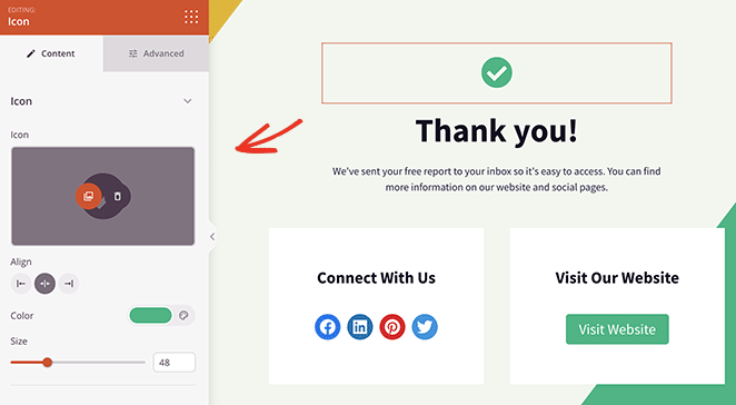
Step 1: Add the Block
Under Design > Blocks, drag and drop the Icon block into the desired section of your page.
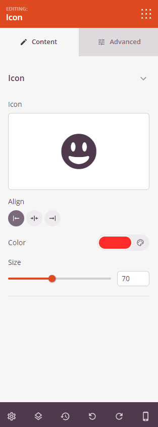
Step 2: Configure Content Settings
Once added, click on the Icon block to open its settings. In the Content tab, configure the icon appearance and link.
Icon:
- Icon: Click the icon picker to browse and select from thousands of available Font Awesome icons. Search by keyword to quickly find the icon you need.
- Alignment: Set the horizontal alignment of the icon within its section — Left, Center, or Right. Supports per-device values for desktop, tablet, and mobile.
- Color: Set the color of the icon using the color picker.
- Size: Set the size of the icon from 10 to 150px using the slider.
- Link: Optionally enter a URL to make the icon a clickable link. Click the settings icon next to the link field to reveal additional link options.
- Open In New Window: Check this option to open the linked URL in a new browser tab.
- No Follow: Check this option to add a
rel="nofollow"attribute to the link, telling search engines not to pass link equity to the destination.
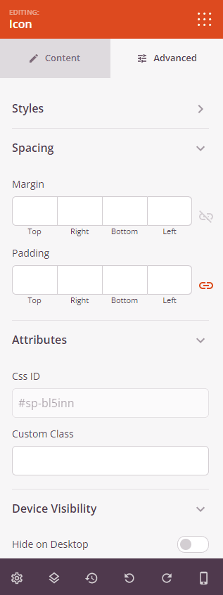
Step 3: Customize the Design
In the Advanced tab, you can customize the shadow styling and spacing of your Icon block.
Styles:
- Text Shadow: Add a shadow effect to the icon. Choose from None, Hairline, Small, Medium, Large, X Large, or 2X Large to give the icon depth and visual emphasis.
Spacing:
- Margin: Control the outer spacing around your Icon block (Top, Right, Bottom, Left). Supports per-device values for desktop, tablet, and mobile.
- Padding: Adjust the inner spacing within your Icon block (Top, Right, Bottom, Left). Supports per-device values for desktop, tablet, and mobile.
Attributes:
- CSS ID: Displays the auto-generated unique identifier for your Icon block, created automatically by SeedProd for custom styling or JavaScript targeting.
- Custom Class: Add custom CSS classes to apply specific styles from your theme or custom CSS.
- Custom Attributes: Add any HTML attributes to the block wrapper element. Enter each attribute on a new line using the format: attribute-name|value.
Device Visibility:
- Hide on Desktop: Hide the Icon block on desktop screens.
- Hide on Tablet: Hide the Icon block on tablet devices.
- Hide on Mobile: Hide the Icon block on mobile devices.
Animation Effects:
- Entrance Animation: Choose an animation effect that plays when the Icon block scrolls into view, such as Bounce, Fade In, Zoom In, Rotate In, and many more.
Step 4: Save Your Changes
Once you have finished configuring the Icon block and customizing its appearance, make sure to save your work.
You’ve successfully added an Icon block to your page! Icons are a simple but powerful way to add visual clarity to your content — they guide the eye, reinforce meaning, and make pages feel more polished. Experiment with different icons, sizes, and colors to find the combination that best fits your design.