The Gallery block allows you to effortlessly add and style beautiful image galleries on your website pages, enhancing the visual appeal of your content.
Simply upload your images, choose how many columns to display, and configure link and sizing options — all without writing any code. It’s the quickest way to add a clean, grid-based image gallery to any SeedProd page.
Adding the Gallery Block to Your Pages
Follow these steps to add a Gallery block to your SeedProd page:
Step 1: Add the Block
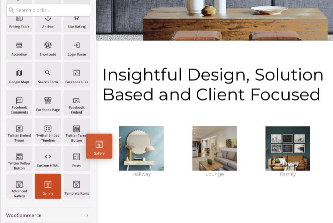
Under Design > Blocks, drag and drop the Gallery block into the desired section of your page.
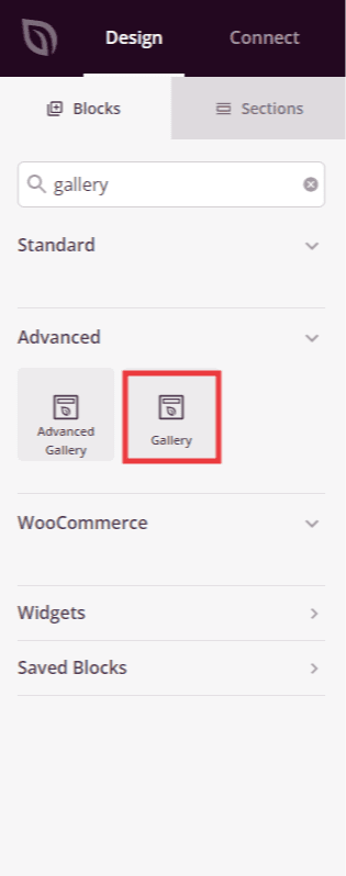
Drag the Gallery block from the Blocks panel and drop it into your page layout.
Step 2: Configure Content Settings
Once added, click on the Gallery block to open its settings. In the Content tab, upload your images and configure how the gallery is displayed.
Gallery Images:
- Images: Upload the photos you want to display in your gallery. You can select multiple images at once from your WordPress media library.
Settings:
- Column: Set the number of columns used to arrange your gallery images in the grid, from 1 to 10.
- Spacing: Adjust the gap between gallery images to control how tightly or loosely the images sit next to each other.
- Link: Choose what happens when a visitor clicks a gallery image — None (no action), Media File (opens the full-size image), or Attachment (links to the image’s WordPress attachment page).
- Image Size: Select the WordPress image size to load — Thumbnail, Medium, or Large. Choosing a smaller size can help improve page load performance.
- Order By: Choose how images are sorted — Default (the order you uploaded them) or Random (shuffled on each page load).
- Lightbox: When Link is set to Media File, enable this option to open clicked images in a fullscreen lightbox overlay instead of navigating away from the page.
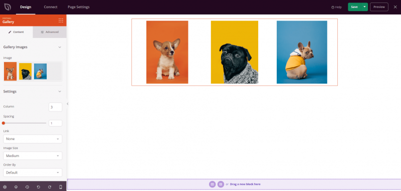
The Content tab lets you upload images and configure columns, spacing, link behavior, image size, and display order.
Step 3: Customize the Design
In the Advanced tab, you can customize the visual appearance of your Gallery block.
Styles:
- Shadow: Apply a drop shadow to your gallery images. Choose from None, Hairline, Small, Medium, Large, X Large, 2X Large, or Bottom Drop Shadow to add depth and dimension to your photos.
- Text Color: Set the color of any text displayed within the gallery, such as caption overlays.
- Image Border: Add a border around each gallery image. Configure the Border Style (Solid, Dotted, or Dashed), Border Width, Border Color, Border Radius (to round the image corners), and Image Whitespace Padding to control the space between the image and its border.
Spacing:
- Margin: Control the outer spacing around your Gallery block (Top, Right, Bottom, Left). This determines how much space appears between the gallery and surrounding elements on the page.
- Padding: Adjust the inner spacing within your Gallery block (Top, Right, Bottom, Left). This creates breathing room between the gallery and the block edges.
Attributes:
- CSS ID: Displays the auto-generated unique identifier for your Gallery block. This ID is created automatically by SeedProd for custom styling or JavaScript targeting.
- Custom Class: Add custom CSS classes to apply specific styles from your theme or custom CSS.
- Custom Attributes: Add any HTML attributes to the gallery wrapper element. Enter each attribute on a new line using the format: attribute-name|value (e.g., data-gallery|portfolio).
Device Visibility:
- Hide on Desktop: Hide the Gallery block on desktop screens.
- Hide on Tablet: Hide the Gallery block on tablet devices.
- Hide on Mobile: Hide the Gallery block on mobile devices.
Animation Effects:
- Entrance Animation: Choose from various animation effects that play when the Gallery block scrolls into view. Options include Bounce, Fade In, Zoom In, Rotate In, and many more, adding a polished feel as visitors scroll down the page.
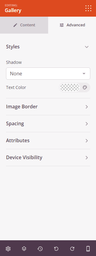
The Advanced tab offers shadow presets, text color, image border styling, spacing controls, and device visibility options.
Step 4: Save Your Changes
Once you have finished configuring the Gallery block and customizing its appearance, make sure to save your work.
You’ve successfully added a Gallery block to your page! The Gallery block makes it simple to showcase photos, portfolios, or any visual content in a clean grid layout. Experiment with different column counts, spacing, shadow styles, and border options to create a gallery that perfectly complements your page design.