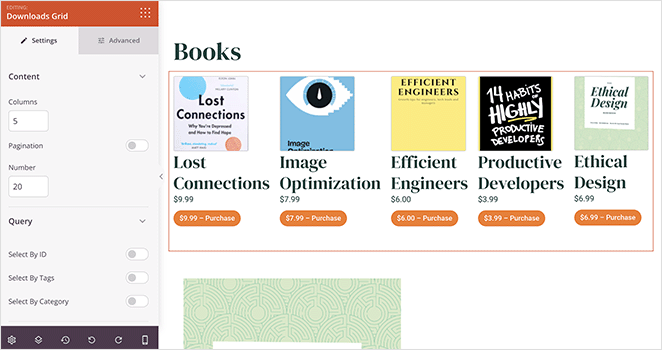
The Downloads Grid block allows you to showcase your Easy Digital Downloads store products in an attractive grid layout directly on any SeedProd page. This block gives you full control over which downloads are displayed, how they are filtered, and how each product card looks.
Whether you want to highlight all your digital products, feature specific downloads by ID, tag, or category, or control exactly which product details appear, the Downloads Grid block makes it easy to build a polished EDD storefront without writing any code.
Adding the Downloads Grid Block to Your Pages
Follow these steps to add a Downloads Grid block to your SeedProd page:
Step 1: Add the Block
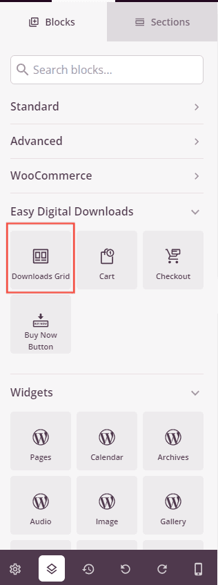
Under Blocks > Easy Digital Downloads, drag and drop the Downloads Grid block into the desired section of your page.
Step 2: Configure Content Settings
Once added, click on the Downloads Grid block to open its settings. In the Content tab, configure how your downloads are displayed and which products appear in the grid.
Content:
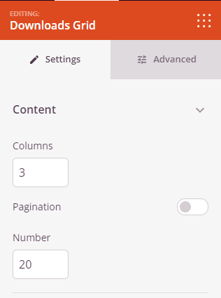
- Columns: Set the number of columns used to display your downloads in the grid.
- Pagination: Toggle pagination on or off. When enabled, downloads are split across multiple pages.
- Number of Downloads: Set the maximum number of downloads to display. Use -1 to show all available downloads.
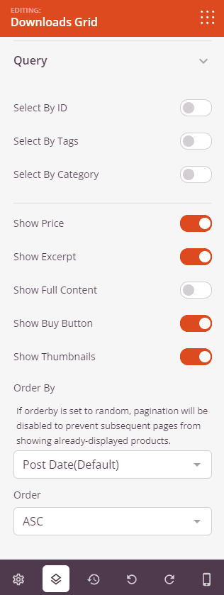
Query:
- IDs: Toggle on to hand-pick specific downloads to display by selecting them from a list of your published products.
- Tags: Toggle on to filter downloads by tag. Choose whether to Include or Exclude downloads matching the selected tags.
- Categories: Toggle on to filter downloads by category. Choose whether to Include or Exclude downloads in the selected categories.
- Relation: When both Tags and Categories filters are active, set whether the combined filters use OR (match either) or AND (must match both) logic.
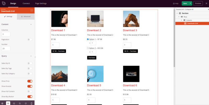
- Price: Toggle to show or hide the product price on each download card.
- Excerpt: Toggle to show or hide the short description on each download card.
- Full Content: Toggle to show or hide the full product description on each download card.
- Buy Button: Toggle to show or hide the purchase button on each download card.
- Thumbnails: Toggle to show or hide the product image on each download card.
- Order By: Choose how downloads are sorted — by Date, ID, Random, or Title. Note: if Order By is set to Random, pagination will be disabled to prevent repeated products across pages.
- Order: Set the sort direction — ASC (ascending) or DESC (descending).
Step 3: Customize the Design
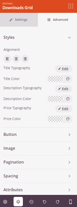
In the Advanced tab, you can style every element of the Downloads Grid block to match your brand.
Styles:
- Alignment: Set the horizontal alignment of the grid content — Left, Center, or Right.
- Title Typography: Customize the font family, weight, size, line height, letter spacing, and text transform for the product title.
- Title Color: Set the color of the product title text.
- Description Typography: Customize the typography for the product description or excerpt text.
- Description Color: Set the color of the description text.
- Price Typography: Customize the typography for the displayed price.
- Price Color: Set the color of the price text.
Button:
- Button Style: Choose from Flat, 2D, Vintage, Ghost, or Link button styles.
- Button Color: Set the background color of the buy button.
- Button Typography: Customize the font settings for the button label text.
- Button Size: Choose from Small, Medium, Large, X Large, or 2X Large.
- Border Radius: Adjust the roundness of the button corners, from 0 to 100.
Image:
- Shadow: Add a drop shadow to product images. Choose from None, Hairline, Small, Medium, Large, X Large, 2X Large, or Bottom Drop Shadow.
- Image Border: Add a border around product images. Configure the Border Style (Solid, Dotted, or Dashed), Border Width, Border Color, Border Radius, and Image Whitespace Padding.
Pagination:
- Pagination Typography: Customize the font settings for the pagination controls.
- Page Color: Set the color of the current page indicator in the pagination.
- Link Color: Set the color of the pagination navigation links.
Spacing:
- Margin: Control the outer spacing around your Downloads Grid block (Top, Right, Bottom, Left).
- Padding: Adjust the inner spacing within your Downloads Grid block (Top, Right, Bottom, Left). Supports per-device values for desktop, tablet, and mobile.
Attributes:
- CSS ID: Displays the auto-generated unique identifier for your Downloads Grid block, created automatically by SeedProd for custom styling or JavaScript targeting.
- Custom Class: Add custom CSS classes to apply specific styles from your theme or custom CSS.
- Custom Attributes: Add any HTML attributes to the block wrapper element. Enter each attribute on a new line using the format: attribute-name|value.
Device Visibility:
- Hide on Desktop: Hide the Downloads Grid block on desktop screens.
- Hide on Tablet: Hide the Downloads Grid block on tablet devices.
- Hide on Mobile: Hide the Downloads Grid block on mobile devices.
Animation Effects:
- Entrance Animation: Choose an animation effect that plays when the Downloads Grid block scrolls into view, such as Bounce, Fade In, Zoom In, Rotate In, and many more.
Step 4: Save Your Changes
Once you have finished configuring the Downloads Grid block and customizing its appearance, make sure to save your work.
You’ve successfully added a Downloads Grid block to your page! The Downloads Grid block is a powerful way to showcase your Easy Digital Downloads products with full control over layout, filtering, and styling. Experiment with different column counts, query filters, and design options to create a product grid that drives conversions and matches your brand.