The Content Toggle block allows you to display two different text sections with an interactive toggle switch. This block provides a convenient and effective way to present multiple sets of information on your website, enabling users to easily switch between different text content areas.
With the Content Toggle block, you can create comparison displays, show alternative pricing plans, present before-and-after scenarios, or deliver any type of switchable text content. This creates a clutter-free browsing experience while maximizing the value of your page space.
Adding the Content Toggle Block to Your Pages
Follow these steps to add a Content Toggle block to your SeedProd page:
Step 1: Add the Block
Under Design > Blocks, drag and drop the Content Toggle block into the desired section of your page.
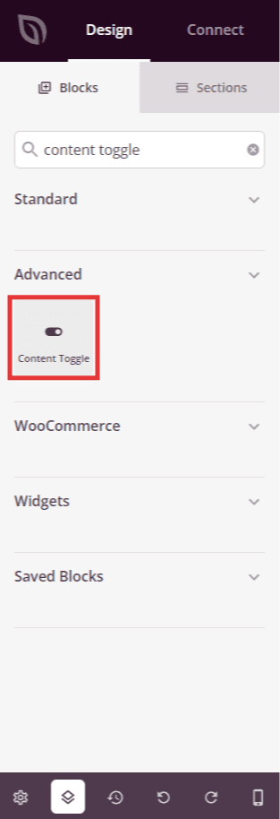
Locate the Content Toggle block in the blocks panel and drag it to your desired location on the page.
Step 2: Configure Content Settings
Once added, click on the Content Toggle block to open its settings. In the Content tab, you can configure the two text content areas that users will toggle between.
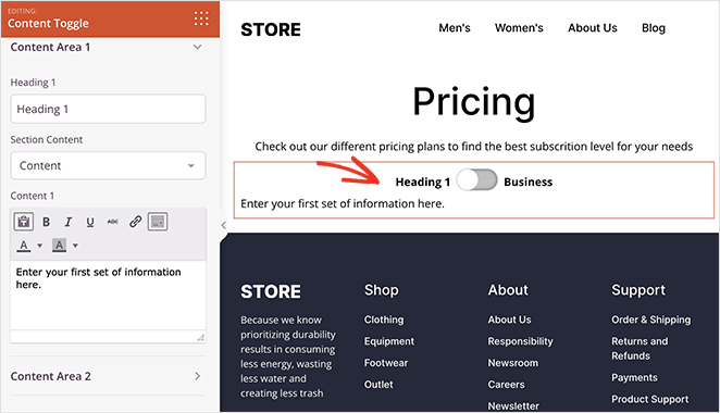
Content Area 1:
- Heading 1: Enter the heading text that will appear above the first content area. This label helps users understand what content they’re viewing
- Section Content: Choose whether to display custom text content, existing content from your site, or template parts in the first toggle area
- Content 1: Add your text content that will appear when the toggle is set to the first position
Content Area 2:
- Heading 2: Enter the heading text that will appear above the second content area. This label describes the alternative content option
- Section Content: Choose whether to display custom text content, existing content from your site, or template parts in the second toggle area
- Content 2: Add your text content that will appear when the toggle is switched to the second position
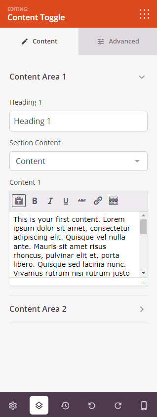
Configure the headings and text content for both toggle areas in the Content tab.
Step 3: Customize the Design
In the Advanced tab, you can customize the visual appearance of your Content Toggle block:
Heading / Content:
- Header 1 Typography: Customize the font family, size, weight, line height, and letter spacing for the first heading. Click Edit to access detailed typography controls
- Header 2 Typography: Customize the font family, size, weight, line height, and letter spacing for the second heading. Click Edit to access detailed typography controls
- Content 1 Typography: Customize the typography settings for the first text content area. Click Edit to access detailed typography controls
- Content 2 Typography: Customize the typography settings for the second text content area. Click Edit to access detailed typography controls
- Heading 1 Color: Set the text color for the first heading to match your page design
- Heading 2 Color: Set the text color for the second heading to match your page design
- Content 1 Color: Set the text color for the first content area
- Content 2 Color: Set the text color for the second content area
- Background Color: Set the background color for the entire Content Toggle block
Switcher:
- Switch Style: Choose the visual style for your toggle switch. Options include Round (circular toggle), Square (rectangular toggle), and Label Box (text-based toggle with box styling)
- Switch Size: Select the size of your toggle switch. Options include Large, Medium, Small, and Mini to match your design needs
- First Background Color: Set the background color for the first toggle position (when Content Area 1 is active)
- Second Background Color: Set the background color for the second toggle position (when Content Area 2 is active)
- Switcher Color: Set the color of the toggle switch element itself
Spacing:
- Margin: Control the outer spacing around your Content Toggle block (Top, Right, Bottom, Left). This determines how much space appears between the toggle and surrounding elements
- Padding: Adjust the inner spacing within your Content Toggle block (Top, Right, Bottom, Left). This creates breathing room between the text content and the block edges
Attributes:
- CSS ID: Displays the auto-generated unique identifier for your Content Toggle block. This ID is created automatically by SeedProd for custom styling or JavaScript targeting
- Custom Class: Add custom CSS classes to apply specific styles from your theme or custom CSS
- Custom Attributes: Add any HTML attributes to the toggle wrapper element. Enter each attribute on a new line using the format: attribute-name|value (e.g., data-section|comparison)
Device Visibility:
- Hide on Desktop: Hide the Content Toggle block on desktop screens
- Hide on Tablet: Hide the Content Toggle block on tablet devices
- Hide on Mobile: Hide the Content Toggle block on mobile devices
Animation Effects:
- Entrance Animation: Choose from various animation effects that play when the Content Toggle scrolls into view. Options include Bounce, Fade In, Zoom In, Rotate In, and many more. This helps draw attention to your interactive toggle and creates visual interest
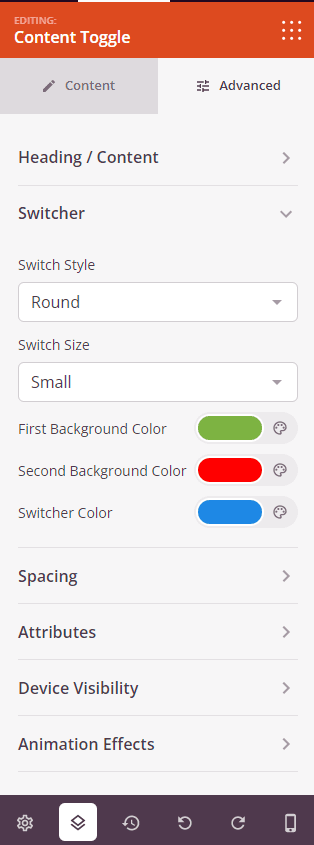
Customize typography, colors, toggle switch appearance, and spacing in the Advanced tab.
Step 4: Save Your Changes
Once you have finished configuring the Content Toggle block and customizing its appearance, make sure to save your work.
You’ve successfully added a Content Toggle block to your page! The Content Toggle block enhances user engagement by providing an interactive way to present alternative text content options without cluttering your page. Experiment with different toggle styles, colors, and content combinations to create an effective comparison or information display that serves your audience.