Are you looking for professional webinar registration page examples?
Do you want to use webinars for lead generation? It makes sense when the cost of setting up a webinar is a fraction of the cost of going on television.
An excellent webinar registration landing page can be the difference between someone attending or bailing out. That’s why in this post, we’ll share some of the best webinar landing pages and webinar registration page examples while telling you why they work.
Was ist eine Webinar-Anmeldeseite?
Webinars are one of the biggest lead generation tools you can use to bring in new customers. A well-executed webinar program can generate tens of thousands of leads per year if set up correctly.
A webinar registration page is a standalone landing page on your website. It’s the first page that potential customers can visit to signup for your webinar.
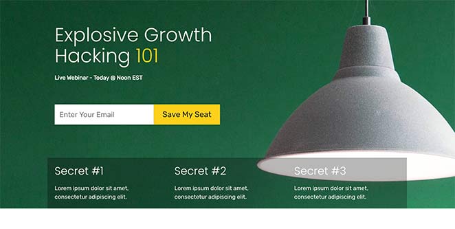
High-converting webinar landing pages are extremely useful for marketing and collecting contact information from potential customers. They often include social proof, call-to-action buttons, and copy that addresses users’ pain points – all of which convince them to fill in your registration form and convert.
In the end, you’ll have a list of engaged users ready to attend your live webinar and tons of warm leads you can nurture down your sales funnel.
What Are the Best Practices for Webinar Registration Pages?
Depending on where you look, you’ll find different opinions on the best way to build a webinar registration page. This is confusing if you’re new to content marketing or you’ve never made one before and it makes it hard to know where to start.
With that in mind, here are some essential best practices to keep in mind for your webinar landing page optimization:
- Start with a strong topic – Choose a webinar topic that captures your target audience’s attention. It should be relevant to their pain points, actionable, and leave them feeling ready to tackle their problems.
- Leverage your guest’s audience – Your guest speaker’s audience is a great way to draw a crowd to your webinar. They’re already warmed to you because you’re working with someone they trust. As a result, they’re more likely to attend and become potential customers.
- Follow up with registrations – After people register for your free webinar, make sure you follow up with them both before and after the event. This gets them used to hearing from you, and with their permission, you can continue to send them relevant content in the future.
- Continue to send traffic to your webinar page – Once your webinar is over, you can still send traffic to your page. Ask users to sign up via a short form to watch an on-demand recording of the webinar. While they can’t ask questions, they won’t have to wait to watch the high-quality video recording.
- Repurpose your webinar content – You can reuse parts of your webinar further down the line to engage your audience and raise brand awareness. Edit them into eye-catching clips to share on social media, embed them in your blog posts, and even in ads to continue to drive traffic to your business. With email automation software, you can even turn your webinar into a mini email course.
What Are Some Great Webinar Registration Page Examples?
Now that you know the best practices for your webinar registration page design, let’s look at some excellent webinar registration page examples.
- 1. Tailwind: Pinterest for Business Webinar
- 2. Vyond: Weekly Webinar Registration Page
- 3. IBM Watson: On-Demand Webinar
- 4. WordStream: Mobile Marketplace Webinar
- 5. Search Engine Journal: SEO Webinar Page Example
- 6. SEMRush: Content Strategy Webinar
- 7. Fresh Egg: Digital Marketing Webinar
- 8. Numerator: Retail Strategy Webinar
- 9. SeedProd: Educate Webinar Landing Page Example
- 10. SeedProd: Travel Webinar
- 11. SeedProd: Profit Webinar Registration Page Template
1. Tailwind: Pinterest for Business Webinar

This webinar page example from Tailwind ticks all the right boxes. At first glance, you can see exactly what it’s about and what you’ll learn from watching.
After the hero area, it includes more details about what attendees will learn. The body copy is easy to read, provide valuable information, and grabs attention with eye-catching icons.
With 4 CTA buttons, it’s easy for users to spot the clickable signup button. Plus, after clicking, the sign-up form only includes a single form field to increase conversion rates.
Why this page works:
- Mehrere CTA-Schaltflächen
- Value-added headlines
- Testimonials for social proof
- Graphics make the text easier to read
2. Vyond: Weekly Webinar Registration Page
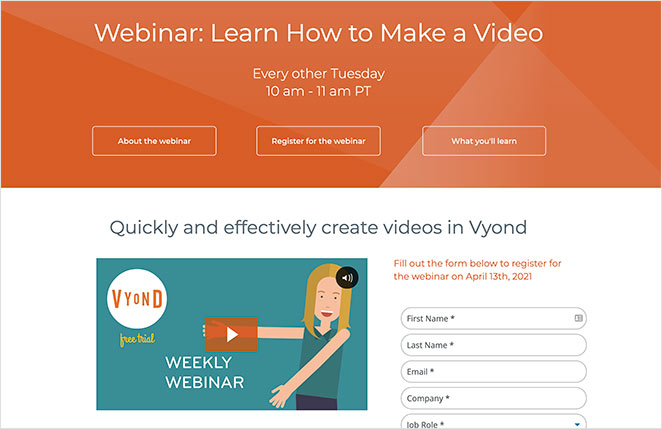
Vyond offers a weekly webinar to show people how to make videos. Its landing page is bright, friendly, and engaging, with everything needed to attract attendees.
At the top of the page is an actionable heading letting users know what they’ll learn. It also tells people when the webinar takes place and includes anchor links that jump to different sections of the page.
The explainer video is a great way to consolidate information and give users the information they need for registering. Then, the registration form is simple, with a clear CTA button users can see easily.
At the bottom of the page are bullet points that break down everything covered in the webinar. And a final CTA button reminds users to register.
Why this page works:
- Value-based headline
- Eye-catching landing page graphics
- Engaging explainer video
- Bullet points for copy
- Mehrere CTA-Schaltflächen
3. IBM Watson: On-Demand Webinar
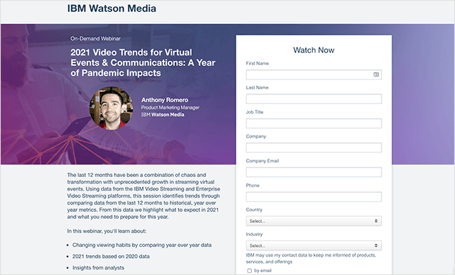
IBM Watson has a slightly different approach to their webinar registration page example. It’s a shorter page than other examples on this list and has a more formal and professional look.
It still works well as a high-converting webinar page and has everything it needs to encourage users to register.
For example, it doesn’t have a navigation menu, so users can’t click away to a different page. The headline has a clear value proposition, and it includes bullet points that make it easy for people to see what they’ll learn.
The registration form is a little longer than we’d prefer, but given their industry, it asks for all the information IBM needs to nurture users through their sales funnel.
Why this page works:
- Actionable headline and subheading
- Speaker details and headshot
- Bullet point webinar details
- Visible webinar registration form
- Contrasting CTA button
4. WordStream: Mobile Marketplace Webinar

This webinar page from WordStream is an excellent example of a high-converting webinar page. As soon as you visit the page, you’re hit with a bold, eye-catching headline promising to teach you to dominate the mobile marketplace.
As you scroll down the page, there are clear blocks of text adding more detail about what you’ll learn. There’s also a section dedicated to learning more about the webinar speakers, which adds authority to the page.
The registration form on this webinar page is shorter, with form fields for names, email addresses, phone numbers, and the user’s website. With fewer form fields, users are more likely to register.
Why this page works:
- A bold, eye-catching headline
- Short paragraphs and bullet points
- Informationen zum Sprecher
- Fewer form fields
- Contrasting CTA buton
- Social media follow buttons
5. Search Engine Journal: SEO Webinar Page Example
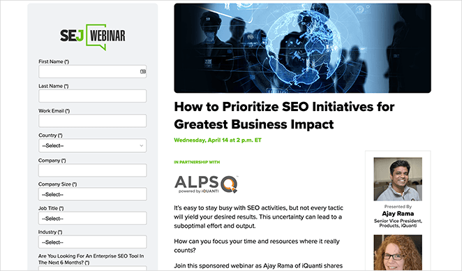
The great thing about this webinar page example from Search Engine Journal is how each element jumps out from the page. The headline offers a clear value proposition and naturally encourages you to continue reading.
With bold bullet points, it’s easier to read the most important details. And down the right-hand side, you can learn who is presenting and moderating the webinar, adding credibility and authority.
The registration form on this page is pretty long. But it’s offset by the high-contrast CTA button, which instantly grabs attention.
Why this page works:
- A clear value proposition in the headline
- Bold bullet points for added clarity
- Speaker and moderator details
- Eyecatching registration form
- Floating social media share buttons
6. SEMRush: Content Strategy Webinar

We love this webinar registration page example from SEMRush for its clarity and simplicity. You’re immediately hit with an attention-grabbing hero area telling you what the webinar is about, when it’s taking place, and who is presenting it.
Below are more details about what they’ll cover, broken down into easy-to-read bullet points. And the most important areas of text are in bold to stand out from the page.
The registration form for this page is minimal and straightforward. It only asks for essential details and nothing more.
Why this page works:
- Attention-grabbing hero area
- Eye-catching graphics
- Value-based headline
- Speaker details
- Easy-to-read copy
- Simple registration form
7. Fresh Egg: Digital Marketing Webinar
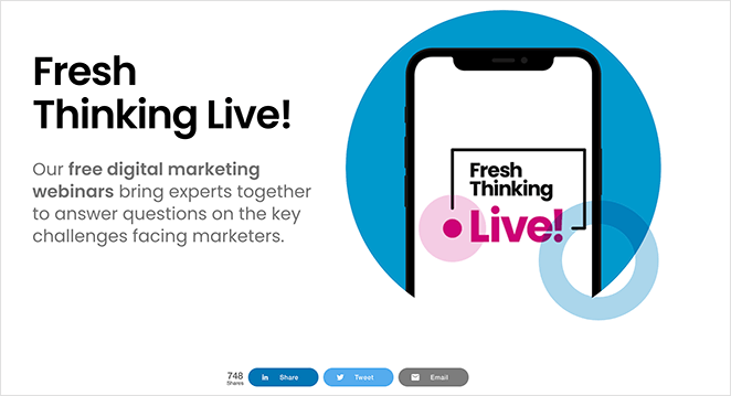
Fresh Egg’s webinar registration page example is an excellent lesson in the power of white space. It’s a minimalist design that works perfectly with the company’s crisp and clean branding.
With bright pops of color in strategic parts of the page, it directs your attention to where it needs you to focus. And the headlines follow suit with bold typography and power words.
The use of video is a great way to keep users engaged long enough to convert. It also consolidates the webinar content in a way that’s easy to understand.
Like the previous example, the sign-up form only asks for the most essential information to increase registrations.
Why this page works:
- Excellent use of white space to direct attention
- Bright pops of color draw the eye to essential information
- Minimal copy with a bold, easy-to-read font
- Engaging explainer video
- Short and simple registration form
8. Numerator: Retail Strategy Webinar
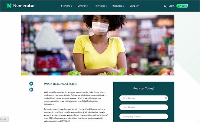
In this webinar page example, Numerator offers an on-demand webinar that users can watch any time they like.
The page starts with a big and bold headline, clearly communicating what people can learn from watching. It also has a large featured image illustrating the webinar content.
Further down the page are easy-to-read blocks of text with bullet points explaining what it covers. And on the right-hand side is a simple registration form in a contrasting color that grabs attention instantly.
Why this page works:
- The bold headline grabs attention immediately
- Eye-catching hero image
- Easy-to-read webinar page copy
- Contrasting registration form
- Minimale Formularfelder
9. SeedProd: Educate Webinar Landing Page Example

This webinar registration page example from SeedProd has everything you need to make a webinar that converts. It includes a powerful headline communicating the value of attending and details about when and where it takes place.
Words like “hurry” and “limited” create a sense of scarcity and urgency that prompts people to act now. And as a result, it can generate a lot more leads and conversions.
Further down the page is a clear bullet list section reaffirming the need to register now before losing your spot. Plus, the CTA button is visible both at the top and bottom of the page for better results.
Why this page works:
- Actionable headlines that offer value
- Webinar time and date details
- Urgency and scarcity tactics
- Clear bullet lists to inform users
- Many CTA buttons
10. SeedProd: Travel Webinar
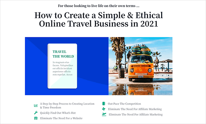
Another excellent webinar page example from SeedProd is their travel webinar page. Upon visiting the page, it’s clear immediately that the webinar is aimed at the travel industry.
The headings use emotional words that tap into people’s needs and wants. And the image reinforces what people want to achieve.
Below the header area is clear bullet points that outline the benefits of attending the webinar. Plus, the large CTA button is big enough for people to spot on both mobile and desktop devices.
Finally, including logos from websites where they’re featured adds authority to the webinar. This makes it easier for users to trust the company and sign up.
Why this page works:
- Headlines address people’s pain points
- Image demonstrates the end result
- Bullet points are easy to read and understand
- Logos add credibility and trust
- CTA button is easy to spot on any screen size
11. SeedProd: Profit Webinar Registration Page Template
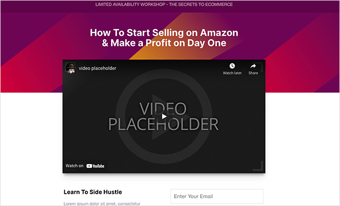
This webinar page template from SeedProd has everything you need to promote your webinar and convert your audience into attendees. The eye-catching header draws attention to the explainer video, which keeps people interested and engaged.
Further down the page are clear sections that allow you to show the benefits users get from attending. You can use this area to add urgency with scarcity phrases, such as “limited availability” and “don’t miss out.”
The registration form only has a single form field to collect email addresses. This is a great way to combat user hesitation and secure more attendees.
Why this page works:
- Attention-grabbing header area
- Engaging explainer video
- Phrases that evoke scarcity and urgency
- Simple registration form
- Large CTA button
How Can You Build a High-Converting Webinar Registration Page?
After looking at the examples above, what is the best way to create a webinar registration page for your business? For WordPress website owners, the easiest solution is to use a WordPress page builder plugin like SeedProd.
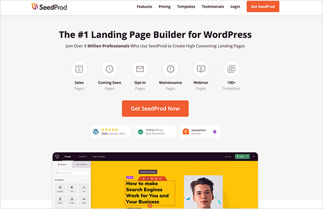
SeedProd is the best WordPress landing page builder on the market. It comes with a user-friendly drag-and-drop builder, making it easy to create successful webinar pages without hiring a developer.
You can design your webinar page from scratch or use one of the responsive webinar landing page templates. From there, you can customize your design in the visual editor with landing page blocks.
SeedProd’s landing page blocks are specially designed to generate leads for your business. They include:
- Standard elements like headlines, images, videos, buttons, spacers, etc.
- Conversion-focused blocks like opt-in forms, giveaway widgets, countdown timers, contact forms, login forms, social media buttons, testimonials, and more.
- WooCommerce blocks like add-to-cart buttons, shopping carts, checkout pages, and product grids.
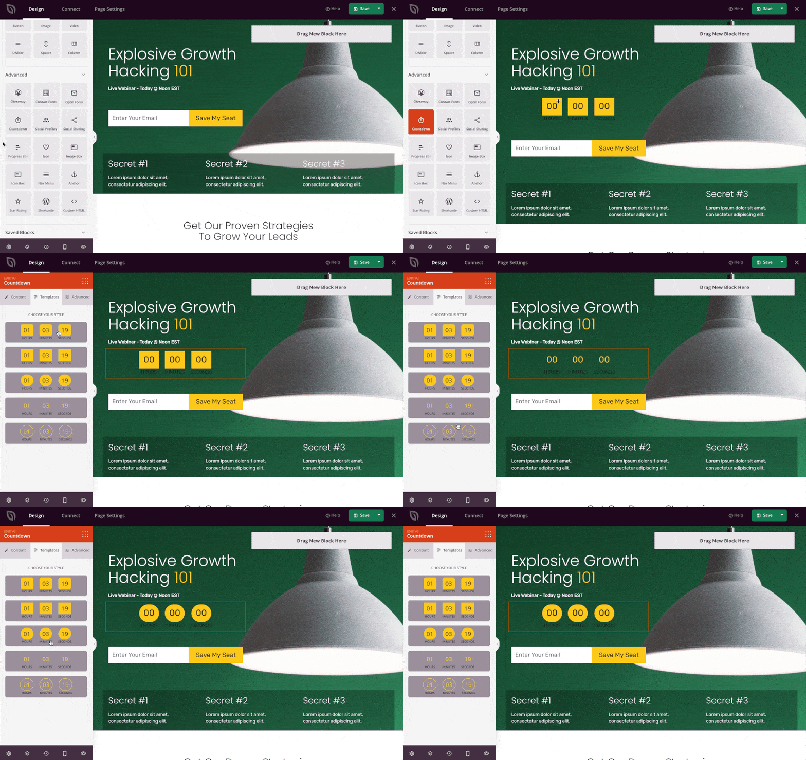
It also integrates with popular email marketing services to grow your email list and Google Analytics to track your landing page performance. Plus, you can manage all of your subscribers in SeedProd’s subscriber management dashboard.
More importantly, this landing page plugin is lightning-fast and bloat-free. This means it won’t slow your website down, keeping users on your page longer and boosting your SEO.
Follow this step-by-step guide to learn how to create a webinar registration page with SeedProd.
Glossary: Key Webinar Page Terms
- Webinar Registration Page: A standalone webpage where people sign up to attend your webinar.
- Landing Page: A focused webpage with a single goal—like getting webinar signups.
- CTA (Call to Action): A button or link that encourages people to take action, like “Register Now.”
Häufig gestellte Fragen
Und da haben Sie es!
We hope this article helped you find some excellent webinar registration page examples and learn the best design practices.
You might also want to learn how to create a thank you page in WordPress when people successfully register.
And if you liked this article, then please follow us on Twitter and Facebook for more helpful content to help grow your business.

