The Device Visibility feature lets you show or hide individual sections, rows, columns, and blocks depending on whether a visitor is viewing your page on a desktop or mobile device. Use it to tailor the content and layout of your page for each device type without creating separate pages.
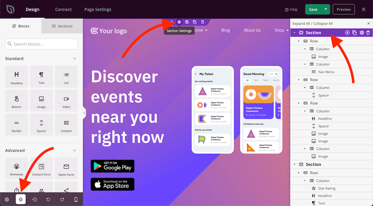
Step 1: Open the Element Settings
Hover over the section, row, column, or block you want to control. Click the gear icon (Settings handle) that appears in the element’s toolbar to open its settings panel.
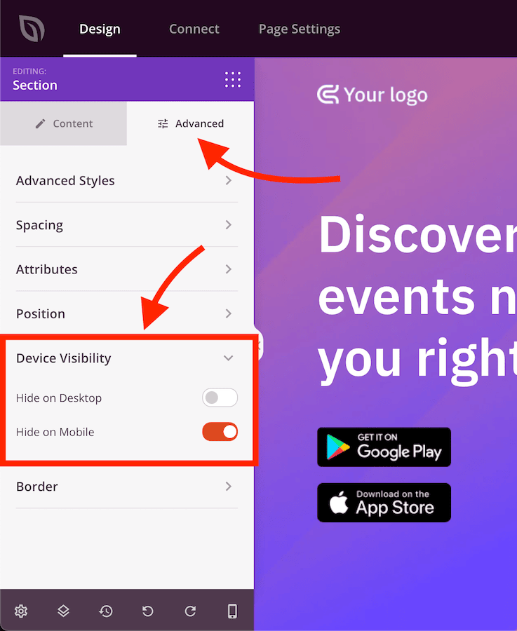
Step 2: Set Device Visibility
In the settings panel, click the Advanced tab and expand the Device Visibility section. Toggle the options to hide the element on desktop, mobile, or both.
Device Visibility settings apply to the element you configured and do not affect any other elements on the page. Repeat the process for each section, row, column, or block you want to show or hide on specific devices. Use the Mobile Device Preview in the builder to verify how the page looks on each device before saving.