Der Block für Produktgalerie-Bilder ermöglicht es Ihnen, Ihre WooCommerce-Produktgalerie-Bilder nahtlos in Einzelproduktvorlagen einzufügen. Er rendert die vollständige Bildergalerie des Produkts – einschließlich Hauptbild und Thumbnails – und bietet Ihnen Steuerelemente zur Gestaltung des Zoom-Buttons sowie der Bild- und Thumbnail-Ränder, um sie an Ihr Design anzupassen.
Dieser Block ist ausschließlich für die Verwendung in Einzelproduktvorlagen konzipiert. Stellen Sie vor Beginn sicher, dass WooCommerce installiert ist und Sie veröffentlichte Produkte mit zugewiesenen Galeriebildern haben.
Hinzufügen des Blocks für Produktgalerie-Bilder zu Ihren Seiten
Befolgen Sie diese Schritte, um einen Block für Produktgalerie-Bilder zu Ihrer SeedProd-Einzelproduktvorlage hinzuzufügen:
Schritt 1: Block hinzufügen
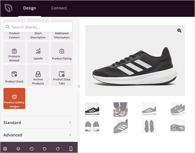
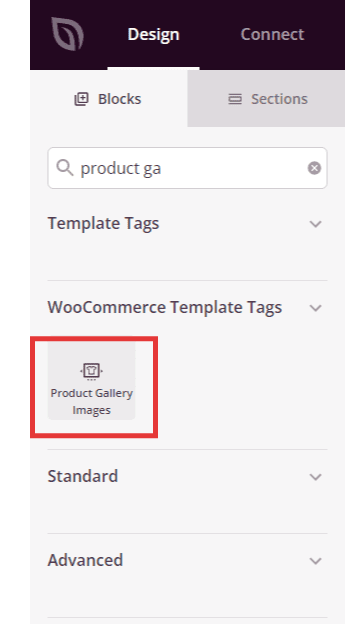
Ziehen Sie unter WooCommerce-Vorlagentags den Block Produktgalerie-Bilder in den gewünschten Abschnitt Ihrer Einzelproduktvorlage und legen Sie ihn dort ab.
Schritt 2: Inhaltseinstellungen konfigurieren
Nach dem Hinzufügen klicken Sie auf den Block für Produktgalerie-Bilder, um seine Einstellungen zu öffnen. Im Tab Inhalt finden Sie die folgenden Optionen.
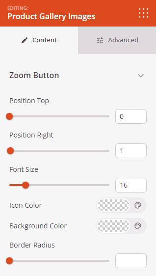
Zoom-Button:
- Obere Position: Legt die vertikale Position des Zoom-Buttons relativ zur Oberkante des Produktbildes fest (in Pixel).
- Rechte Position: Legt die horizontale Position des Zoom-Buttons relativ zum rechten Rand des Produktbildes fest (in Pixel).
- Schriftgröße: Legt die Größe des Zoom-Icons fest.
- Icon-Farbe: Legt die Farbe des Zoom-Icons fest.
- Hintergrundfarbe: Legt die Hintergrundfarbe des Zoom-Buttons fest.
- Randradius: Passt die Rundung der Ecken des Zoom-Buttons mit einem Schieberegler an.
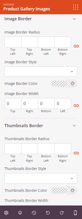
Bildrand:
- Bildrandradius: Legt die Rundung der Ecken des Hauptproduktbildes fest.
- Bildrandbreite: Legt die Dicke des Randes auf jeder Seite des Hauptproduktbildes fest.
Thumbnail-Rand:
- Thumbnail-Randradius: Legt die Rundung der Ecken der Thumbnail-Bilder unterhalb des Hauptproduktbildes fest.
- Thumbnail-Randbreite: Legt die Dicke des Randes auf jeder Seite der Thumbnail-Bilder fest.
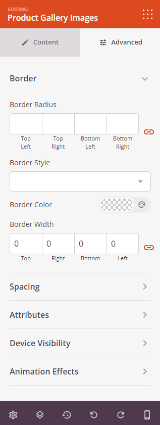
Schritt 3: Design anpassen
Im Tab Erweitert können Sie das Erscheinungsbild Ihres Blocks für Produktgalerie-Bilder weiter anpassen.
Rahmen:
- Randstil: Legt den Randstil des Block-Wrappers fest – durchgezogen, gepunktet oder gestrichelt.
- Randfarbe: Legt die Farbe des Randes des Block-Wrappers fest.
- Randbreite: Legt die Dicke des Randes auf jeder Seite des Block-Wrappers fest.
- Randradius: Legt die Rundung der Ecken des Block-Wrappers fest.
Abstand:
- Abstand: Legen Sie den äußeren Abstand um den Block auf allen vier Seiten fest, mit unabhängigen Steuerelementen für Desktop, Tablet und Mobilgerät.
- Innenabstand: Legen Sie den inneren Abstand innerhalb des Block-Wrappers auf allen vier Seiten fest, mit geräteabhängigen Steuerelementen.
Attribute:
- Benutzerdefinierte Klasse: Fügen Sie dem Block-Wrapper eine oder mehrere benutzerdefinierte CSS-Klassen für gezieltes Styling hinzu.
- CSS-ID: SeedProd generiert automatisch eine eindeutige CSS-ID für diesen Block. Sie können diese verwenden, um den Block in benutzerdefiniertem CSS oder JavaScript zu referenzieren.
- Benutzerdefinierte Attribute: Fügen Sie dem Block-Wrapper-Element benutzerdefinierte HTML-Attribute hinzu. Geben Sie jedes Attribut in einer neuen Zeile im Schlüssel|Wert-Format ein.
Gerätesichtbarkeit:
- Auf Desktop ausblenden: Umschalten, um den Block auf Desktop-Bildschirmen auszublenden.
- Auf Tablet ausblenden: Umschalten, um den Block auf Tablet-Bildschirmen auszublenden.
- Auf Mobilgeräten ausblenden: Umschalten, um den Block auf Mobilgeräten auszublenden.
Animationseffekte:
- Scrolleffekt: Wenden Sie eine scrollgesteuerte Animation auf den Block an, einschließlich Optionen für vertikales und horizontales Scrollen mit Steuerelementen für Richtung, Geschwindigkeit und Ansichtsfensterversatz.
- Mauseffekt: Wenden Sie einen Parallax-Effekt auf den Block an, der durch Mausbewegungen gesteuert wird.
Schritt 4: Speichern Sie Ihre Änderungen
Nachdem Sie die Konfiguration des Blocks für Produktgalerie-Bilder abgeschlossen und sein Erscheinungsbild angepasst haben, stellen Sie sicher, dass Sie Ihre Arbeit speichern.
Sie haben erfolgreich einen Produktgalerie-Bilder-Block zu Ihrer Vorlage für einzelne Produkte hinzugefügt! Mit Steuerelementen für die Positionierung des Zoom-Buttons, die Gestaltung von Bildrändern und die Darstellung von Miniaturansichten können Sie eine polierte Produktgalerie erstellen, die Kunden eine gründliche und optisch ansprechende Ansicht von allem bietet, was Sie verkaufen.