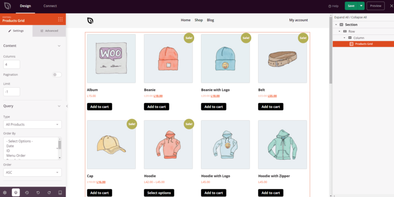
The Products Grid block provides an efficient way to display your WooCommerce products in a visually organized grid layout. You can show all products, or filter by type — featured, on sale, best selling, recently added, or top rated — and give customers the ability to add multiple items to their cart directly from the grid.
With flexible query controls, per-device alignment, button and image styling, and optional pagination, this block is ideal for shop pages, category landing pages, or any page where you want to showcase a curated selection of products in a clean, browsable format.
Adding the Products Grid Block to Your Pages
Follow these steps to add a Products Grid block to your SeedProd page:
Step 1: Add the Block
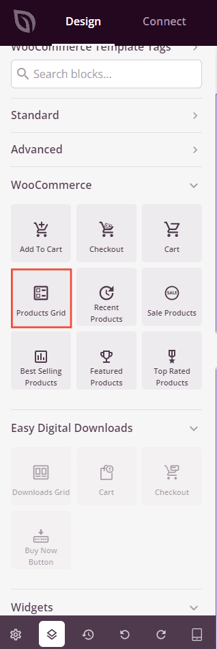
Under Design > Blocks > WooCommerce, drag and drop the Products Grid block into the desired section of your page.
Step 2: Configure Settings
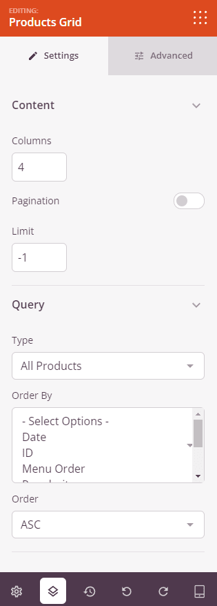
Once added, click on the Products Grid block to open its settings. In the Settings tab, settings are organized into two sections.
Content:
- Columns: Set the number of product columns to display in the grid.
- Pagination: Toggle on to enable pagination, breaking the product grid across multiple pages.
- Show Items Count: Toggle on to display the total number of products shown.
- Show Order By: Toggle on to display a sort dropdown so visitors can reorder products by criteria such as price, popularity, or rating.
- Limit: Set the maximum number of products to display. Use
-1to show all matching products (default).
Query:
- Type: Choose which products to display — All Products, Featured Products, Sale Products, Best Selling Products, Recent Products, or Top Rated Products.
- Include: Narrow the product selection by filtering to include only products matching specific criteria such as IDs, SKUs, categories, tags, attributes, groups, or visibility.
- Exclude: Narrow the product selection by filtering to exclude products matching specific criteria such as IDs, SKUs, categories, tags, attributes, groups, or visibility.
- Order By: Set how products are sorted — by Date, Title, Price, Popularity, Rating, Random, or Menu Order.
- Order: Set the sort direction — ASC (ascending) or DESC (descending).
Step 3: Customize the Design
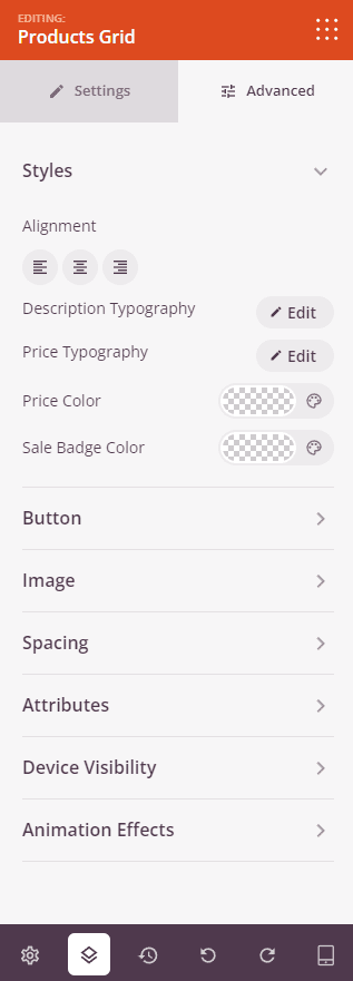
In the Advanced tab, you can customize the visual appearance of your Products Grid block. Settings are organized into three sections.
Styles:
- Alignment: Set the horizontal alignment of the product grid — Left, Center, or Right — with per-device controls for desktop, tablet, and mobile.
- Description Typography: Set the font family, size, line height, letter spacing, weight, style, and case for product description text.
- Price Typography: Set the font family, size, line height, letter spacing, weight, style, and case for product price text.
- Price Color: Set the color of the regular product price.
- Sale Color: Set the color of the sale price when a product is discounted.
Button:
- Button Style: Choose a visual style for the Add to Cart button — Flat, 2D, Vintage, Ghost, or Link.
- Button Color: Set the background color of the Add to Cart button.
- Button Typography: Set the font family, size, line height, letter spacing, weight, style, and case for button text.
- Button Size: Choose a preset button size — Small, Medium, Large, X Large, or 2X Large.
- Border Radius: Adjust the corner roundness of the Add to Cart button using a slider.
Image:
- Shadow: Apply a shadow to product images using preset sizes — None, Hairline, Small, Medium, Large, X Large, 2X Large, or Bottom Drop Shadow.
- Border Style: Set the border style of product images — Solid, Dotted, or Dashed.
- Image Border Color: Set the color of the product image border.
- Image Border Width: Set the border thickness on each side (Top, Right, Bottom, Left) of the product image.
- Image Whitespace Padding: Add inner padding around product images within their border.
Spacing:
- Margin: Set the outer spacing around the block on all four sides, with independent controls for desktop, tablet, and mobile.
- Padding: Set the inner spacing inside the block wrapper on all four sides, with per-device controls.
Attributes:
- Custom Class: Add one or more custom CSS classes to the block wrapper for targeted styling.
- CSS ID: SeedProd automatically generates a unique CSS ID for this block. You can use it to reference the block in custom CSS or JavaScript.
- Custom Attributes: Add custom HTML attributes to the block wrapper element. Enter each attribute on a new line using the key|value format.
Device Visibility:
- Hide on Desktop: Toggle to hide the block when viewed on desktop screens.
- Hide on Tablet: Toggle to hide the block when viewed on tablet screens.
- Hide on Mobile: Toggle to hide the block when viewed on mobile screens.
Animation Effects:
- Scrolling Effect: Apply a scroll-triggered animation to the block, including Vertical Scroll and Horizontal Scroll options with direction, speed, and viewport offset controls.
- Mouse Effect: Apply a mouse movement-driven parallax effect to the block.
Step 4: Save Your Changes
Once you have finished configuring the Products Grid block and customizing its appearance, make sure to save your work.
You’ve successfully added a Products Grid block to your page! Whether you’re building a full shop page or a targeted promotional section, the flexible query controls and rich styling options make it easy to display exactly the right products in exactly the right way. Experiment with different product types, column counts, and button styles to create a grid that encourages browsing and drives purchases.