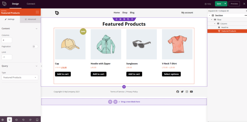
The Featured Products block displays your WooCommerce featured products in a clean, browsable grid. It’s designed to highlight items you’ve marked as featured in WooCommerce, making it easy to surface your best or most promoted products on any page without any manual curation needed at the page level.
Before using this block, make sure you have designated the relevant products as featured items in your WooCommerce product settings. Once that’s done, you can use the block’s query controls to further filter, sort, and limit which featured products appear, and customize the grid’s typography, button styles, and product image presentation from the Advanced tab.
Adding the Featured Products Block to Your Pages
Follow these steps to add a Featured Products block to your SeedProd page:
ステップ1:ブロックを追加する
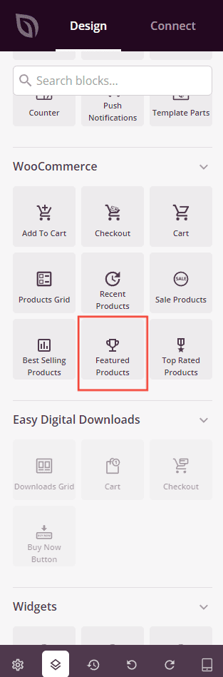
Under Design > Blocks > WooCommerce, drag and drop the Featured Products block into the desired section of your page.
ステップ 2: 設定を構成する
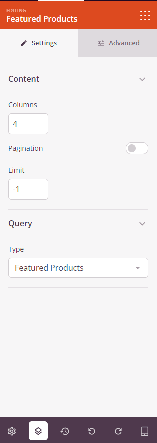
Once added, click on the Featured Products block to open its settings. In the Settings tab, settings are organized into two sections.
コンテンツ:
- 列:グリッドに表示する商品列の数を設定します。
- ページネーション:トグルをオンにしてページネーションを有効にし、商品グリッドを複数のページに分割します。
- アイテム数を表示:トグルをオンにして、表示される商品の総数を表示します。
- 並べ替え順を表示:トグルをオンにして並べ替えドロップダウンを表示し、訪問者が価格、人気、評価などの基準で商品を並べ替えられるようにします。
- Limit: Set the maximum number of products to display. Use
-1to show all matching featured products (default).
クエリ:
- Type: Choose which products to display — All Products, Featured Products, Sale Products, Best Selling Products, Recent Products, or Top Rated Products. This block defaults to Featured Products.
- 並べ替え順:商品の並べ替え方法を設定します — 日付、タイトル、価格、人気、評価、ランダム、またはメニュー順。
- 順序: 並び替えの方向を設定します — ASC(昇順)またはDESC(降順)。
ステップ3:デザインをカスタマイズする
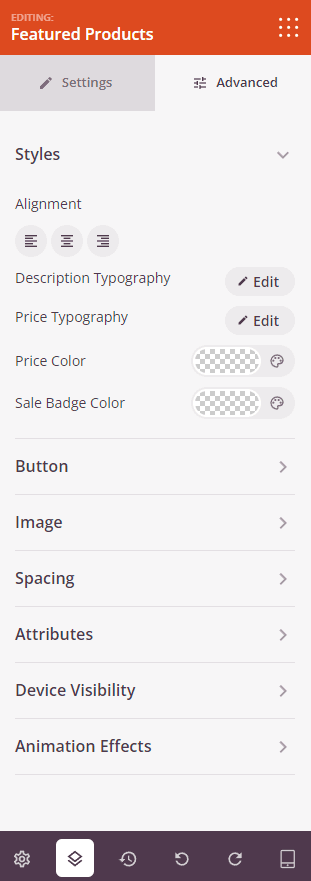
In the Advanced tab, you can customize the visual appearance of your Featured Products block. Settings are organized into three sections.
スタイル:
- 配置:デスクトップ、タブレット、モバイルのデバイスごとのコントロールを使用して、商品グリッドの水平方向の配置(左、中央、右)を設定します。
- 説明のタイポグラフィ:商品説明テキストのフォントファミリー、サイズ、行の高さ、文字間隔、太さ、スタイル、およびケースを設定します。
- 価格のタイポグラフィ: 商品価格テキストのフォントファミリー、サイズ、行の高さ、文字間隔、太さ、スタイル、大文字/小文字を設定します。
- 価格の色: 通常の商品の価格の色を設定します。
- セール価格の色: 商品が割引されている場合のセール価格の色を設定します。
ボタン:
- ボタンのスタイル: カートに追加ボタンのビジュアルスタイルを選択します — フラット、2D、ビンテージ、ゴースト、またはリンク。
- ボタンの色: カートに追加ボタンの背景色を設定します。
- ボタンのタイポグラフィ: ボタンテキストのフォントファミリー、サイズ、行の高さ、文字間隔、太さ、スタイル、大文字/小文字を設定します。
- ボタンのサイズ: 事前設定されたボタンサイズを選択します — 小、中、大、特大、超特大。
- 角丸: スライダーを使用して、カートに追加ボタンの角の丸みを調整します。
画像:
- 影: 事前設定されたサイズ — なし、極細、小、中、大、特大、超特大、または下部ドロップシャドウを使用して、商品画像に影を適用します。
- 境界線のスタイル: 商品画像の境界線のスタイルを設定します — 実線、点線、または破線。
- 画像境界線の色: 商品画像の境界線の色を設定します。
- 画像境界線の幅: 商品画像の各辺(上、右、下、左)の境界線の太さを設定します。
- 画像余白: 境界線内の商品画像の周りに内側の余白を追加します。
間隔:
- マージン: ブロックの外側のスペーシングを4つの側面すべてに設定します。デスクトップ、タブレット、モバイルで個別に制御できます。
- パディング: ブロックラッパーの内側のスペーシングを4つの側面すべてに設定します。デバイスごとに制御できます。
属性:
- カスタムクラス: ブロックラッパーに1つ以上のカスタムCSSクラスを追加して、ターゲットを絞ったスタイリングを行います。
- CSS ID: SeedProdは、このブロックに一意のCSS IDを自動的に生成します。カスタムCSSまたはJavaScriptでブロックを参照するために使用できます。
- カスタム属性: ブロックラッパー要素にカスタムHTML属性を追加します。キー|値の形式で、各属性を新しい行に入力します。
デバイス表示:
- デスクトップで非表示: デスクトップ画面で表示されたときにブロックを非表示にするには、トグルします。
- タブレットで非表示: タブレット画面で表示されたときにブロックを非表示にするには、トグルします。
- モバイルで非表示: モバイル画面で表示されたときにブロックを非表示にするには、トグルします。
アニメーション効果:
- スクロールエフェクト: ブロックにスクロールでトリガーされるアニメーションを適用します。方向、速度、ビューポートオフセット制御を備えた垂直スクロールおよび水平スクロールオプションが含まれます。
- マウスエフェクト: マウスの動きによって駆動されるパララックス効果をブロックに適用します。
ステップ4:変更を保存
Once you have finished configuring the Featured Products block and customizing its appearance, make sure to save your work.
You’ve successfully added a Featured Products block to your page! By surfacing your hand-picked featured items in a styled, configurable grid, you can draw attention to your most important products without any extra manual work on each page. Experiment with column counts, button styles, and image settings to create a product showcase that looks great and drives conversions.