La función Visibilidad del dispositivo te permite mostrar u ocultar secciones, filas, columnas y bloques individuales según si un visitante está viendo tu página en un dispositivo de escritorio o móvil. Úsala para adaptar el contenido y el diseño de tu página a cada tipo de dispositivo sin crear páginas separadas.
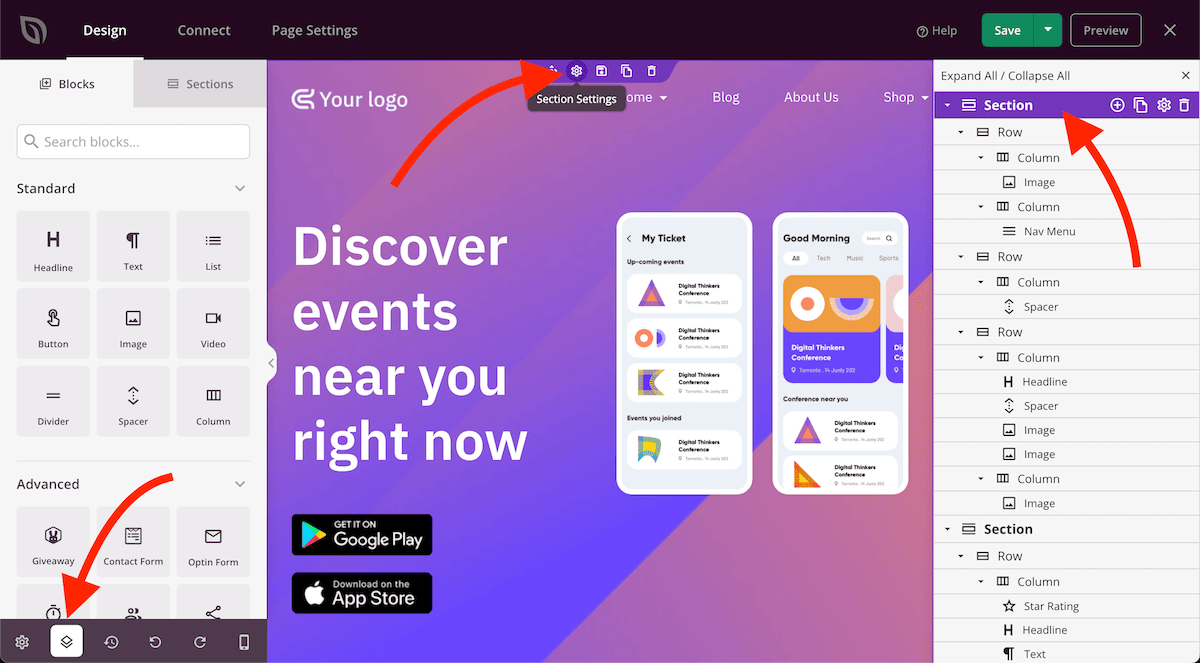
Paso 1: Abrir la configuración del elemento
Pasa el cursor sobre la sección, fila, columna o bloque que deseas controlar. Haz clic en el icono del engranaje (controlador de configuración) que aparece en la barra de herramientas del elemento para abrir su panel de configuración.
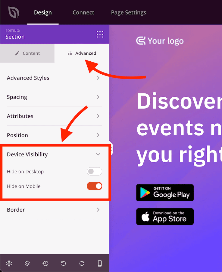
Paso 2: Establecer la visibilidad del dispositivo
En el panel de configuración, haz clic en la pestaña Avanzado y expande la sección Visibilidad del dispositivo. Activa las opciones para ocultar el elemento en escritorio, móvil o ambos.
La configuración de Visibilidad del dispositivo se aplica al elemento que has configurado y no afecta a ningún otro elemento de la página. Repite el proceso para cada sección, fila, columna o bloque que desees mostrar u ocultar en dispositivos específicos. Usa la Vista previa del dispositivo móvil en el constructor para verificar cómo se ve la página en cada dispositivo antes de guardar.