Der Sterne-Bewertungs-Block ermöglicht es Ihnen, eine visuelle Sterne-Bewertung auf jeder SeedProd-Seite anzuzeigen. Egal, ob Sie ein Produkt bewerten, eine Dienstleistung beurteilen oder einem Testimonial Glaubwürdigkeit verleihen möchten, der Block rendert eine Reihe von gefüllten Stern-Symbolen neben einer optionalen Textbeschriftung – und gibt Besuchern auf einen Blick ein sofort erkennbares Qualitätsmerkmal an die Hand.
Sie haben die volle Kontrolle über die Skala (0–5 oder 0–10), den genauen Bewertungswert und wie die Sterne dimensioniert und angeordnet werden. In Kombination mit Typografie- und Farboptionen kann der Sterne-Bewertungs-Block nahtlos an jedes Designsystem angepasst werden, von auffälligen Marketingseiten bis hin zu minimalistischen Bewertungs-Layouts.

Hinzufügen des Sterne-Bewertungs-Blocks zu Ihren Seiten
Befolgen Sie diese Schritte, um einen Sterne-Bewertungs-Block zu Ihrer SeedProd-Seite hinzuzufügen:
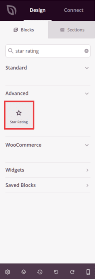
Schritt 1: Block hinzufügen
Ziehen Sie unter Design > Blöcke den Sterne-Bewertung-Block per Drag & Drop in den gewünschten Bereich Ihrer Seite.
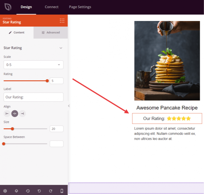
Schritt 2: Inhaltseinstellungen konfigurieren
Sobald er hinzugefügt wurde, klicken Sie auf den Sterne-Bewertungs-Block, um seine Einstellungen zu öffnen. Konfigurieren Sie im Tab Inhalt die Bewertungsanzeige im Abschnitt Sterne-Bewertung:
- Skala: Wählen Sie im Dropdown-Menü zwischen einer 0–5 oder 0–10 Bewertungs-Skala.
- Bewertung: Legen Sie den genauen Bewertungswert mit dem Schieberegler fest. Der verfügbare Bereich passt sich Ihrer gewählten Skala an – bis zu 5 oder bis zu 10 in Schritten von 0,5.
- Beschriftung: Geben Sie eine optionale Textbeschriftung ein, die neben den Sternen angezeigt wird, z. B. eine Bewertungsanzahl oder eine kurze Beschreibung (z. B. „4,5 von 5“).
- Ausrichtung: Legen Sie die horizontale Ausrichtung der Sternenreihe fest – Links, Mitte oder Rechts – mit gerätespezifischer Steuerung für Desktop, Tablet und Mobilgeräte.
- Größe: Passen Sie die Symbolgröße mit dem Schieberegler (0–100px) an, um Ihre Sterne größer oder kleiner zu machen.
- Abstand: Steuern Sie den Abstand zwischen den einzelnen Stern-Symbolen mit dem Schieberegler (1–100px).
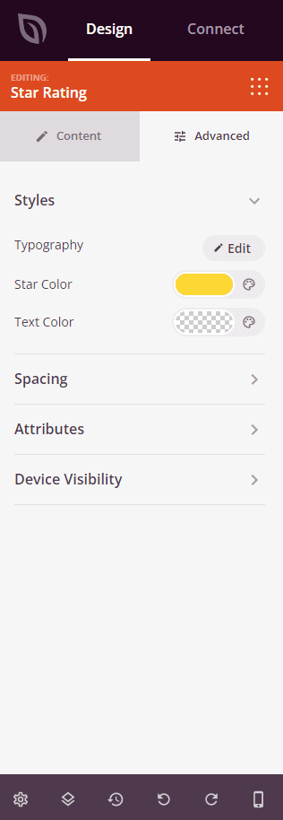
Schritt 3: Design anpassen
Im Tab Erweitert können Sie das visuelle Erscheinungsbild Ihres Sterne-Bewertungs-Blocks anpassen. Der Abschnitt Stile enthält die folgenden Optionen:
- Typografie: Legen Sie Schriftfamilie, Größe, Stärke, Stil, Zeilenhöhe, Zeichenabstand und Groß-/Kleinschreibung für den Beschriftungstext fest.
- Sternfarbe: Wählen Sie die Füllfarbe für die Stern-Symbole (Standard ist Gold).
- Textfarbe: Legen Sie die Farbe des Beschriftungstextes fest, der neben den Sternen angezeigt wird.
Der Tab Erweitert bietet auch Steuerelemente für Abstände (Rand und Innenabstand), benutzerdefinierte CSS-Attribute, Geräte-Sichtbarkeit und Eingangs-Animationen.
Schritt 4: Speichern Sie Ihre Änderungen
Sobald Sie die Konfiguration des Sterne-Bewertungs-Blocks abgeschlossen und sein Erscheinungsbild angepasst haben, stellen Sie sicher, dass Sie Ihre Arbeit speichern.
Sie haben erfolgreich einen Star-Rating-Block zu Ihrer Seite hinzugefügt! Verwenden Sie ihn in Testimonials, Produktbewertungen, Fallstudien oder überall dort, wo Sie Qualität und Glaubwürdigkeit auf einen Blick vermitteln möchten. Experimentieren Sie mit verschiedenen Größen, Farben und Beschriftungstexten, um eine Sternebewertung zu erstellen, die sich natürlich in Ihr Seitendesign einfügt.