Shape Dividers add decorative separator effects to the top and bottom edges of sections and columns on your page. SeedProd includes 18 shape styles to choose from, letting you create smooth transitions and visual interest between page sections without any design experience.
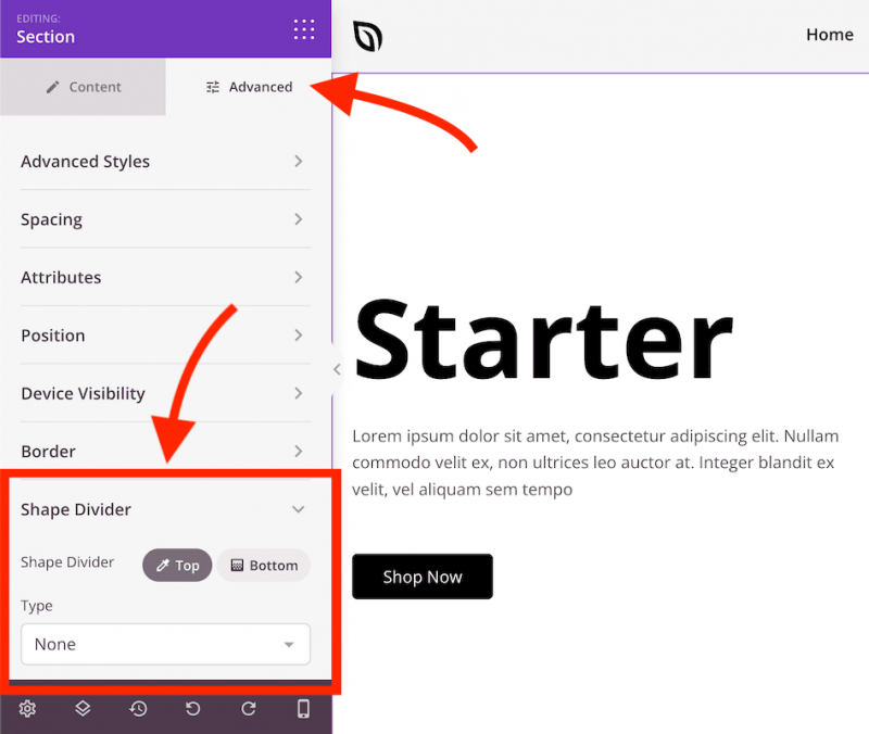
Adding a Shape Divider
- Select the section or column you want to add a shape divider to. Click the gear icon (Settings handle) when hovering over the element’s edge, or select it from the Layout Navigation panel.
- In the settings panel, click the Advanced tab and expand the Shape Divider section.
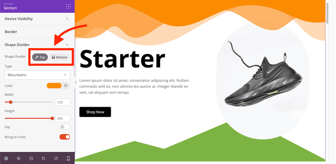
- Select the position — Top or Bottom — then choose a shape style from the Type dropdown menu.
Customization Options
Once a shape type is selected, the following options become available:
- Color: Set the fill color of the shape divider.
- Width: Adjust how wide the shape spans across the section.
- Height: Control how tall the shape divider appears.
- Flip: Mirror the shape horizontally for a reversed orientation.
- Bring to Front: Display the shape divider in front of all other elements within the section or column.
Shape dividers are a simple way to add visual polish between sections of your page. Experiment with different shapes, sizes, and colors to create smooth transitions that complement your overall design.