Der Block „Aktuelle Produkte“ zeigt Ihre zuletzt veröffentlichten WooCommerce-Produkte in einem übersichtlichen, durchsuchbaren Raster an. Es ist eine einfache Möglichkeit, wiederkehrende Besucher über Ihre neuesten Ergänzungen auf dem Laufenden zu halten und neue Artikel auf jeder Seite Ihres Shops hervorzuheben.
Sie können steuern, wie viele Produkte angezeigt werden, wie sie sortiert werden und optionale Filter mithilfe der Abfrage-Steuerelemente anwenden. Der Tab „Erweitert“ gibt Ihnen die volle Kontrolle über Typografie, Schaltflächenstile und die Darstellung von Produktbildern des Rasters, um sie an das Branding Ihres Shops anzupassen.
Hinzufügen des Blocks „Aktuelle Produkte“ zu Ihren Seiten
Befolgen Sie diese Schritte, um einen Block „Aktuelle Produkte“ zu Ihrer SeedProd-Seite hinzuzufügen:
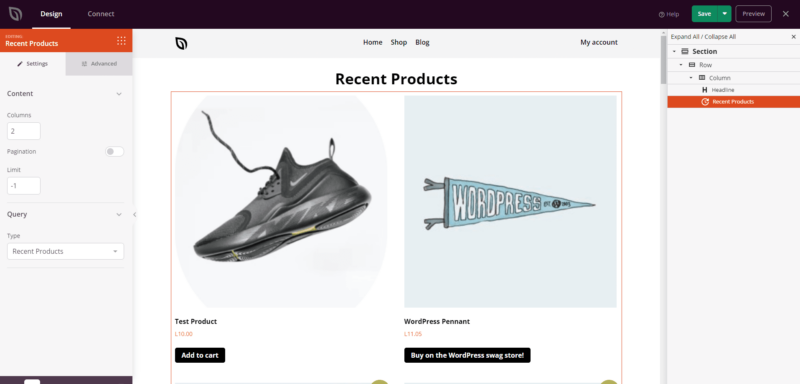
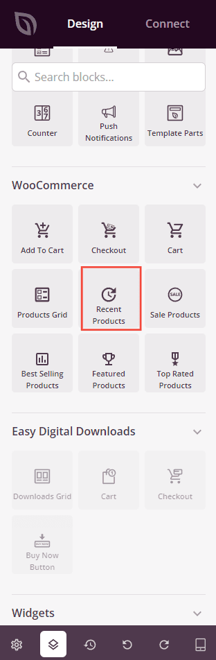
Schritt 1: Block hinzufügen
Ziehen Sie unter Design > Blöcke > WooCommerce den Block Aktuelle Produkte in den gewünschten Bereich Ihrer Seite.
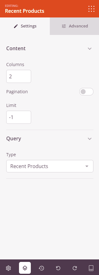
Schritt 2: Einstellungen konfigurieren
Sobald der Block hinzugefügt wurde, klicken Sie darauf, um seine Einstellungen zu öffnen. Im Tab Einstellungen sind die Einstellungen in zwei Abschnitte unterteilt.
Inhalt:
- Spalten: Legen Sie die Anzahl der Produktspalten fest, die im Raster angezeigt werden sollen.
- Paginierung: Schalten Sie diese Option ein, um die Paginierung zu aktivieren und das Produkt-Raster auf mehrere Seiten aufzuteilen.
- Anzahl der Elemente anzeigen: Schalten Sie diese Option ein, um die Gesamtzahl der angezeigten Produkte anzuzeigen.
- Sortierung anzeigen: Schalten Sie diese Option ein, um ein Dropdown-Menü zur Sortierung anzuzeigen, damit Besucher Produkte nach Kriterien wie Preis, Beliebtheit oder Bewertung neu ordnen können.
- Limit: Legen Sie die maximale Anzahl der anzuzeigenden Produkte fest. Verwenden Sie
-1, um alle passenden aktuellen Produkte anzuzeigen (Standard).
Abfrage:
- Typ: Wählen Sie aus, welche Produkte angezeigt werden sollen – Alle Produkte, Vorgestellte Produkte, Angebotsartikel, Bestseller, Aktuelle Produkte oder Top-bewertete Produkte. Dieser Block zeigt standardmäßig Aktuelle Produkte an.
- Sortieren nach: Legen Sie fest, wie Produkte sortiert werden – nach Datum, Titel, Preis, Beliebtheit, Bewertung, Zufällig oder Menüreihenfolge.
- Reihenfolge: Legen Sie die Sortierrichtung fest – ASC (aufsteigend) oder DESC (absteigend).
Schritt 3: Design anpassen
Im Tab Erweitert können Sie das visuelle Erscheinungsbild Ihres Blocks „Aktuelle Produkte“ anpassen. Die Einstellungen sind in drei Abschnitte unterteilt.
Stile:
- Ausrichtung: Legen Sie die horizontale Ausrichtung des Produkt-Rasters fest – Links, Mitte oder Rechts – mit geräteabhängigen Steuerelementen für Desktop, Tablet und Mobilgerät.
- Typografie der Beschreibung: Legen Sie Schriftfamilie, Größe, Zeilenhöhe, Buchstabenabstand, Schriftschnitt, Stil und Groß-/Kleinschreibung für den Text der Produktbeschreibung fest.
- Schriftart für Preise: Legen Sie Schriftfamilie, Größe, Zeilenhöhe, Buchstabenabstand, Schriftschnitt, Stil und Groß-/Kleinschreibung für den Produktpreis fest.
- Farbe für Preise: Legen Sie die Farbe des regulären Produktpreises fest.
- Farbe für Angebote: Legen Sie die Farbe des Angebotspreises fest, wenn ein Produkt reduziert ist.
Schaltfläche:
- Button-Stil: Wählen Sie einen visuellen Stil für die Schaltfläche „In den Warenkorb“ – Flach, 2D, Vintage, Ghost oder Link.
- Button-Farbe: Legen Sie die Hintergrundfarbe der Schaltfläche „In den Warenkorb“ fest.
- Schriftart für Buttons: Legen Sie Schriftfamilie, Größe, Zeilenhöhe, Buchstabenabstand, Schriftschnitt, Stil und Groß-/Kleinschreibung für den Button-Text fest.
- Button-Größe: Wählen Sie eine voreingestellte Button-Größe – Klein, Mittel, Groß, X-Groß oder XX-Groß.
- Abgerundete Ecken: Passen Sie die Rundung der Ecken der Schaltfläche „In den Warenkorb“ mit einem Schieberegler an.
Bild:
- Schatten: Wenden Sie einen Schatten auf Produktbilder an, indem Sie vordefinierte Größen verwenden – Keine, Haarlin, Klein, Mittel, Groß, X-Groß, 2X-Groß oder Schatten unten.
- Rahmenstil: Legen Sie den Rahmenstil von Produktbildern fest – Durchgezogen, Gepunktet oder Gestrichelt.
- Bildrahmenfarbe: Legen Sie die Farbe des Produktbildrahmens fest.
- Rahmenbreite des Bildes: Legen Sie die Rahmenstärke auf jeder Seite (Oben, Rechts, Unten, Links) des Produktbildes fest.
- Leerraum-Abstand des Bildes: Fügen Sie einen inneren Abstand um Produktbilder innerhalb ihres Rahmens hinzu.
Abstand:
- Abstand: Legen Sie den äußeren Abstand um den Block auf allen vier Seiten fest, mit unabhängigen Steuerelementen für Desktop, Tablet und Mobilgerät.
- Innenabstand: Legen Sie den inneren Abstand innerhalb des Block-Wrappers auf allen vier Seiten fest, mit geräteabhängigen Steuerelementen.
Attribute:
- Benutzerdefinierte Klasse: Fügen Sie dem Block-Wrapper eine oder mehrere benutzerdefinierte CSS-Klassen für gezieltes Styling hinzu.
- CSS-ID: SeedProd generiert automatisch eine eindeutige CSS-ID für diesen Block. Sie können diese verwenden, um den Block in benutzerdefiniertem CSS oder JavaScript zu referenzieren.
- Benutzerdefinierte Attribute: Fügen Sie dem Block-Wrapper-Element benutzerdefinierte HTML-Attribute hinzu. Geben Sie jedes Attribut in einer neuen Zeile im Schlüssel|Wert-Format ein.
Gerätesichtbarkeit:
- Auf Desktop ausblenden: Umschalten, um den Block auf Desktop-Bildschirmen auszublenden.
- Auf Tablet ausblenden: Umschalten, um den Block auf Tablet-Bildschirmen auszublenden.
- Auf Mobilgeräten ausblenden: Umschalten, um den Block auf Mobilgeräten auszublenden.
Animationseffekte:
- Scrolleffekt: Wenden Sie eine scrollgesteuerte Animation auf den Block an, einschließlich Optionen für vertikales und horizontales Scrollen mit Steuerelementen für Richtung, Geschwindigkeit und Ansichtsfensterversatz.
- Mauseffekt: Wenden Sie einen Parallax-Effekt auf den Block an, der durch Mausbewegungen gesteuert wird.
Schritt 4: Speichern Sie Ihre Änderungen
Nachdem Sie die Konfiguration des Blocks „Aktuelle Produkte“ abgeschlossen und sein Erscheinungsbild angepasst haben, stellen Sie sicher, dass Sie Ihre Arbeit speichern.
Sie haben erfolgreich einen Block „Aktuelle Produkte“ zu Ihrer Seite hinzugefügt! Das Hervorheben Ihrer neuesten Produkte ist eine großartige Möglichkeit, wiederkehrende Besucher mit frischen Inhalten zu belohnen und neue Artikel hervorzuheben. Experimentieren Sie mit Spaltenanzahlen, Schaltflächenstilen und Sortieroptionen, um Ihre neuesten Ankünfte im bestmöglichen Licht zu präsentieren.