The Product Data Tabs block displays your WooCommerce product description, additional information, and customer reviews in a tabbed layout on your Single Product Templates. Instead of presenting all product information in a single scrolling block, the tabbed interface organizes it into clearly labeled sections that shoppers can navigate with a single click.
This block is designed exclusively for use on Single Product Templates and requires WooCommerce to be installed. You can fully customize the appearance of both the tabs and their content panels — including colors, typography, borders, spacing, and shadows — to match your store’s design.
Adding the Product Data Tabs Block to Your Pages
Follow these steps to add a Product Data Tabs block to your SeedProd Single Product Template:
Step 1: Add the Block
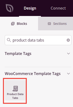
Under Design > Blocks > WooCommerce Template Tags, drag and drop the Product Data Tabs block into the desired section of your Single Product Template.
Step 2: Configure Content Settings
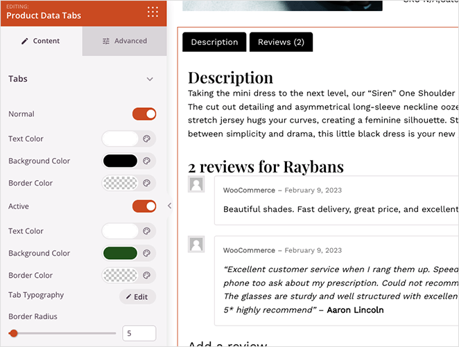
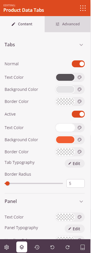
Once added, click on the Product Data Tabs block to open its settings. The Content tab is divided into two collapsible sections — Tabs and Panel — where you can style the tab buttons and the content area beneath them.
Tabs:
- Normal: Toggle on to reveal color settings for tabs in their default (unselected) state. Set the Text Color, Background Color, and Border Color for inactive tabs.
- Active: Toggle on to reveal color settings for the currently selected tab. Set the Text Color, Background Color, and Border Color for the active tab state, allowing it to stand out clearly from the inactive tabs.
- Tab Typography: Set the font family, size, weight, line height, and letter spacing for the tab label text.
- Border Radius: Set the corner rounding (0–100px) for the tab buttons. Increase this value to create pill-shaped or rounded tabs.
Panel:
- Text Color: Set the default text color for content displayed inside the panel area.
- Panel Typography: Set the font family, size, weight, and style for the body text within each panel.
- Heading Color: Set the color for any heading elements (h2, h3, etc.) displayed within the panel content.
- Heading Typography: Set the font family, size, weight, and style for panel heading text.
- Panel Padding: Set the inner spacing around the content within the panel area.
- Panel Shadow: Add a shadow effect to the panel area — choose from preset shadow sizes to give the panel depth and separation from the page background.
Step 3: Customize the Design
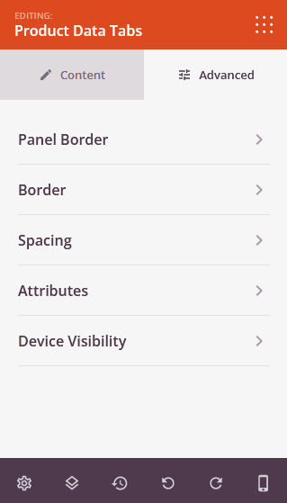
In the Advanced tab, you can refine the borders, spacing, and visibility of your Product Data Tabs block.
Panel Border:
- Panel Border Radius: Set the corner rounding for the panel content area.
- Panel Border Width: Set the border thickness for each side of the panel (Top, Right, Bottom, Left).
- Panel Border Style and Color: Choose a border style (Solid, Dotted, or Dashed) and set a border color for the panel area.
Block Border:
- Border Radius: Set the overall corner rounding for the entire Product Data Tabs block.
- Border Width: Set the border thickness per side for the outer block wrapper.
- Border Style and Color: Choose a border style and color for the outer block wrapper.
Spacing:
- Margin: Control the outer spacing around your Product Data Tabs block (Top, Right, Bottom, Left). This determines how much space appears between the tabs and surrounding elements on the page.
- Padding: Adjust the inner spacing within your Product Data Tabs block (Top, Right, Bottom, Left). This creates breathing room between the tabs content and the block edges.
Attributes:
- CSS ID: Displays the auto-generated unique identifier for your Product Data Tabs block. This ID is created automatically by SeedProd for custom styling or JavaScript targeting.
- Custom Class: Add custom CSS classes to apply specific styles from your theme or custom CSS.
- Custom Attributes: Add any HTML attributes to the block wrapper element. Enter each attribute on a new line using the format: attribute-name|value (e.g., data-section|tabs).
Device Visibility:
- Hide on Desktop: Hide the Product Data Tabs block on desktop screens.
- Hide on Tablet: Hide the Product Data Tabs block on tablet devices.
- Hide on Mobile: Hide the Product Data Tabs block on mobile devices.
Animation Effects:
- Entrance Animation: Choose from various animation effects that play when the Product Data Tabs block scrolls into view. Options include Bounce, Fade In, Zoom In, Rotate In, and many more.
Step 4: Save Your Changes
Once you have finished configuring the Product Data Tabs block and customizing its appearance, make sure to save your work.
You’ve successfully added a Product Data Tabs block to your Single Product Template! The block automatically pulls the product description, additional information, and customer reviews from WooCommerce and organizes them into a clean tabbed interface. Use the tab color settings to differentiate active and inactive states, and adjust the panel typography and borders to create a cohesive product page experience that keeps shoppers engaged.