El bloque de formulario de inicio de sesión te permite añadir un formulario de inicio de sesión de WordPress totalmente funcional directamente a cualquier página de SeedProd. Este bloque es ideal para crear páginas de inicio de sesión personalizadas, portales de miembros y áreas con acceso restringido sin depender de la página de inicio de sesión predeterminada de WordPress.
El bloque incluye campos de nombre de usuario y contraseña, un botón de inicio de sesión, una casilla de verificación "Recordarme", un enlace de "contraseña olvidada" y control total sobre el estilo de los campos, la tipografía y los colores, todo personalizable sin necesidad de escribir código.
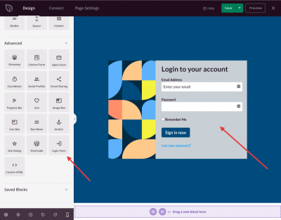
Añadir el bloque de formulario de inicio de sesión a tus páginas
Sigue estos pasos para añadir un bloque de formulario de inicio de sesión a tu página de SeedProd:
Paso 1: Añadir el Bloque
En Diseño > Bloques, arrastra y suelta el bloque Formulario de inicio de sesión en la sección deseada de tu página.
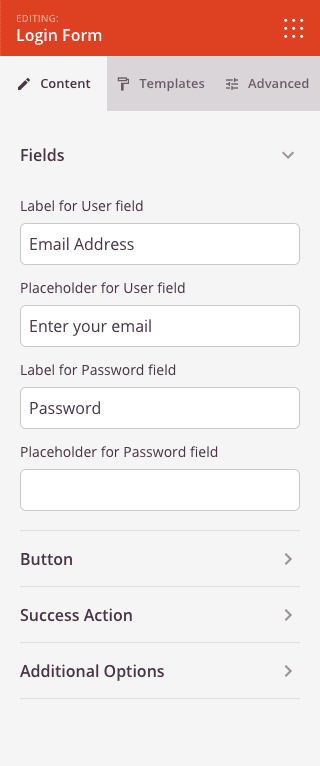
Paso 2: Configurar los Ajustes de Contenido
Una vez añadido, haz clic en el bloque de formulario de inicio de sesión para abrir su configuración. La pestaña Contenido está organizada en cuatro secciones: Campos, Botón, Acción de éxito y Opciones adicionales.
Campos:
- Etiqueta para el campo de usuario: Personaliza el texto de la etiqueta que se muestra encima del campo de entrada de nombre de usuario o correo electrónico.
- Texto de marcador de posición para el campo de usuario: Establece el texto de marcador de posición que se muestra dentro del campo de entrada de nombre de usuario o correo electrónico cuando está vacío.
- Etiqueta para el campo de contraseña: Personaliza el texto de la etiqueta que se muestra encima del campo de entrada de contraseña.
- Texto de marcador de posición para el campo de contraseña: Establece el texto de marcador de posición que se muestra dentro del campo de entrada de contraseña cuando está vacío.
Botón:
- Texto del botón: Personaliza la etiqueta que se muestra en el botón de envío del inicio de sesión.
Acción de Éxito:
- URL de redirección: Introduce una URL a la que redirigir al usuario después de un inicio de sesión correcto. Deja en blanco para usar el comportamiento de redirección predeterminado de WordPress.
- Texto para usuario conectado: Introduce el mensaje que se muestra en lugar del formulario de inicio de sesión cuando el usuario ya ha iniciado sesión. Usa
{user}como marcador de posición y se reemplazará por el nombre para mostrar del usuario.
Opciones Adicionales:
- Etiqueta "Recordarme": Personaliza el texto de la etiqueta de la casilla de verificación "Recordarme" (por ejemplo, "Recordarme").
- Texto del enlace "Contraseña olvidada": Personaliza el texto del enlace "contraseña olvidada" que se muestra debajo del formulario (por ejemplo, "¿Has olvidado tu contraseña?").
Paso 3: Elige una plantilla (Opcional)
La pestaña Plantillas ofrece un conjunto de preajustes de estilo de campo prediseñados. Haz clic en cualquier plantilla para aplicar instantáneamente una combinación de ajustes de fondo, borde y radio de los campos. Los preajustes disponibles incluyen estilos de campo de entrada Claros, Sin borde, Borde ancho, Grises, Oscuros, Borde inferior y Transparentes.
Paso 4: Personaliza el diseño
En la pestaña Avanzado, puedes ajustar los colores, la tipografía y el tamaño de todos los elementos del formulario. La pestaña está organizada en cuatro secciones: Colores, Formulario, Campos y Botón.
Colores:
- Color del enlace: Establece el color de los enlaces "Recordarme" y "contraseña olvidada".
- Color del texto de la etiqueta: Establece el color del texto de la etiqueta del campo.
- Color del texto del campo: Establece el color del texto que se escribe en los campos de entrada.
- Color de fondo del campo: Establece el color de fondo de los campos de entrada.
- Color del borde del campo: Establece el color del borde de los campos de entrada.
- Color de fondo del botón: Establece el color de fondo del botón de inicio de sesión.
Formulario:
- Fuente de la etiqueta: Elige la familia de fuentes y la variante de fuente para las etiquetas de los campos.
- Tamaño de fuente de la etiqueta: Establece el tamaño de fuente de las etiquetas de los campos de 10 a 30 px.
- Espaciado de filas: Establece el espaciado vertical entre las filas del formulario de 0 a 30 px.
- Alineación: Establece la alineación horizontal de todo el formulario — Izquierda, Centro o Derecha.
Campos:
- Fuente del campo: Elige la familia de fuentes y la variante de fuente para el texto dentro de los campos de entrada.
- Tamaño del campo: Establece el tamaño general de los campos de entrada: Pequeño, Mediano o Grande.
- Ancho del campo: Establece el ancho de los campos de entrada como un porcentaje del 10 al 100 %.
- Espaciado de etiquetas: Establece el espaciado entre la etiqueta y el campo de entrada de 0 a 30 px.
- Ancho del borde del campo: Establece el ancho del borde para cada lado de los campos de entrada (Superior, Derecho, Inferior, Izquierdo) de forma independiente.
- Radio del borde del campo: Establece el radio de las esquinas de los campos de entrada de 0 a 50 px.
Botón:
- Fuente del botón: Elige la familia de fuentes y la variante de fuente para el texto del botón de inicio de sesión.
- Tamaño del botón: Establece el tamaño general del botón de inicio de sesión: Pequeño, Mediano o Grande.
- Radio del borde del botón: Establece el radio de las esquinas del botón de inicio de sesión de 0 a 50 px.
También puedes controlar el espaciado, las clases CSS personalizadas, la visibilidad del dispositivo y las animaciones de entrada en las secciones restantes de la pestaña Avanzado.
Paso 5: Guardar tus cambios
Una vez que hayas terminado de configurar el bloque de Formulario de inicio de sesión y personalizar su apariencia, asegúrate de guardar tu trabajo.
¡Has añadido con éxito un bloque de Formulario de inicio de sesión a tu página! Un formulario de inicio de sesión bien diseñado genera confianza y facilita el acceso de los miembros a tu contenido. Utiliza la pestaña Plantillas para obtener ajustes preestablecidos rápidos de estilo de campos, o profundiza en la pestaña Avanzado para que coincidan todos los colores, fuentes y tamaños con tu marca.