Le bloc Produits d'Archive vous permet d'afficher une grille de produits WooCommerce sur vos modèles d'archives de produits. Ce bloc affiche automatiquement les listes de produits sur les pages de boutique, les archives de catégories, les archives d'étiquettes et d'autres pages de collection de produits avec des mises en page et des options de filtrage personnalisables.
Ce bloc est essentiel pour créer des modèles d'archives de produits personnalisés où vous souhaitez un contrôle total sur la façon dont vos produits sont affichés. Vous pouvez personnaliser le nombre de colonnes, activer la pagination, ajouter des options de tri et filtrer les produits qui apparaissent en fonction des catégories, des étiquettes, des attributs ou d'autres critères, créant ainsi une expérience d'achat qui correspond parfaitement à votre marque.
Ajouter le bloc Produits d'Archive à vos pages
Suivez ces étapes pour ajouter un bloc Produits d'Archive à votre modèle d'archive de produits SeedProd :
Étape 1 : Ajouter le bloc
Sous Conception > Blocs > Balises de modèle WooCommerce, faites glisser et déposez le bloc Produits d'Archive dans la section souhaitée de votre modèle d'archive de produits.
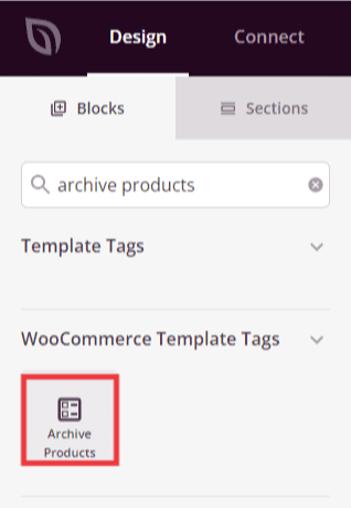
Le bloc Produits d'Archive se trouve sous Balises de modèle WooCommerce et peut être ajouté à votre modèle d'archive de produits.
Étape 2 : Configurer les paramètres de contenu
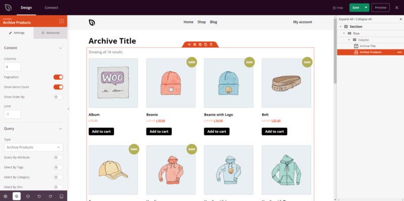
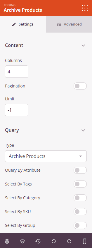
Une fois ajouté, cliquez sur le bloc Produits d'Archive pour ouvrir ses paramètres. Dans l'onglet Contenu, vous pouvez configurer la façon dont les produits sont affichés et filtrés.
Paramètres de mise en page :
- Colonnes : Définissez le nombre de colonnes dans votre grille de produits. Plus de colonnes permettent d'afficher plus de produits par ligne, tandis que moins de colonnes donnent plus de poids à chaque produit. Les mises en page courantes incluent 3 ou 4 colonnes.
- Pagination : Activez ou désactivez les contrôles de pagination. Lorsqu'elle est activée, les produits sont répartis sur plusieurs pages avec des boutons de navigation.
- Afficher le nombre d'articles : Activez pour afficher le nombre total de produits trouvés (par exemple, « Affichage des résultats 1-12 sur 48 »).
- Afficher le tri par : Activez pour afficher un menu déroulant qui permet aux visiteurs de trier les produits par des critères tels que la popularité, la note, le prix ou la nouveauté.
- Limite : Définissez le nombre maximum de produits à afficher par page. Cela fonctionne avec la pagination pour déterminer combien de produits apparaissent avant que les visiteurs ne doivent cliquer sur « Suivant ».
Requête :
- Type : Réglez sur « Produits d'Archive » pour afficher les produits en fonction de l'archive en cours visualisée (catégorie, étiquette, etc.).
- Requête par : Choisissez comment filtrer les produits qui apparaissent. Les options incluent l'Attribut (filtrer par attributs de produit), les Étiquettes (afficher les produits avec des étiquettes spécifiques), la Catégorie (afficher les produits de certaines catégories), le SKU (filtrer par SKU de produit), le Groupe (filtrer par regroupements de produits) ou la Visibilité (contrôler quels produits s'affichent en fonction des paramètres de visibilité du catalogue).
- Sélectionner par étiquettes : Lors de la requête par étiquettes, choisissez les étiquettes de produit à inclure ou à exclure.
- Sélectionner par catégorie : Lors de la recherche par catégorie, sélectionnez les catégories de produits à afficher
- Sélectionner par SKU : Lors de la recherche par SKU, saisissez les SKU de produits spécifiques à afficher
- Sélectionner par groupe : Lors de la recherche par groupe, choisissez les regroupements de produits pour filtrer
- Sélectionner par visibilité : Contrôlez si vous souhaitez afficher les produits marqués comme visibles dans le catalogue, visibles dans la recherche, masqués ou en vedette
L'onglet Contenu vous permet de configurer les colonnes, la pagination, les limites de produits et les options de filtrage pour votre archive de produits.
Étape 3 : Personnaliser le design
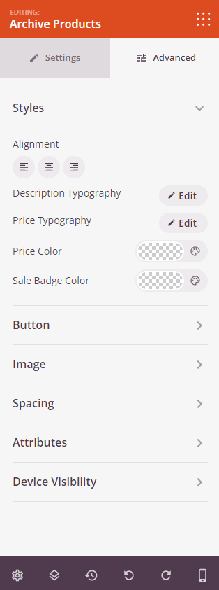
Dans l'onglet Avancé, vous pouvez personnaliser l'apparence visuelle de votre bloc d'archive de produits :
Styles :
- Alignement : Définissez l'alignement horizontal des articles de produits dans la grille (gauche, centre ou droite)
- Typographie de la description : Contrôlez les propriétés de la police des descriptions de produits, y compris la famille de polices, la taille, le poids et le style
- Typographie du prix : Personnalisez les propriétés de la police des prix des produits
- Couleur du prix : Définissez la couleur des prix des produits pour les faire ressortir
- Couleur du badge promotionnel : Choisissez la couleur des badges promotionnels qui apparaissent sur les produits en promotion
Bouton :
- Style du bouton : Choisissez le style visuel des boutons « Ajouter au panier ». Les options incluent Plat (design plat moderne), 2D (profondeur subtile), Vintage (look classique), Fantôme (transparent avec bordure) ou Lien (lien texte simple)
- Couleur du bouton : Définissez la couleur d'arrière-plan des boutons de produits
- Typographie du bouton : Personnalisez les propriétés de la police du texte du bouton
- Taille du bouton : Choisissez la taille du bouton parmi Petit, Moyen, Grand, Très grand ou Extrêmement grand
- Rayon de la bordure : Contrôlez l'arrondi des coins des boutons. Des valeurs plus élevées créent des boutons plus arrondis
Image :
- Ombre : Ajoutez des effets d'ombre aux images de produits pour leur donner de la profondeur. Choisissez parmi Aucune, Cheveux, Petite, Moyenne, Grande, Très grande, Extrêmement grande ou Ombre portée inférieure
- Bordure de l'image : Activez les bordures autour des images de produits
- Rayon de la bordure : Contrôlez l'arrondi des coins des images
- Style de bordure : Choisissez l'apparence de la bordure : Continue (ligne continue), Pointillée (petits points) ou Tirets (traits courts)
- Couleur de la bordure : Sélectionnez la couleur des bordures d'image
- Largeur de la bordure : Définissez l'épaisseur de bordure individuelle pour chaque côté (Haut, Droite, Bas, Gauche)
- Espace blanc de l'image : Ajoutez un remplissage interne autour des images de produits pour créer de l'espace
Espacement :
- Marge : Contrôlez l'espacement extérieur autour de votre bloc d'archive de produits (Haut, Droite, Bas, Gauche). Cela détermine l'espace entre la grille de produits et les éléments environnants
- Rembourrage : Ajustez l'espacement intérieur de votre bloc d'archive de produits (Haut, Droite, Bas, Gauche). Cela crée de l'espace entre la grille de produits et les bords du bloc
Attributs :
- ID CSS : Affiche l’identifiant unique généré automatiquement pour votre bloc Produits d’archives. Cet ID est créé automatiquement par SeedProd pour la personnalisation du style ou le ciblage JavaScript.
- Classe personnalisée : Ajoutez des classes CSS personnalisées pour appliquer des styles spécifiques de votre thème ou de votre CSS personnalisé
- Attributs personnalisés : Ajoutez des attributs HTML à l’élément conteneur du bloc. Entrez chaque attribut sur une nouvelle ligne en utilisant le format : nom-attribut|valeur (par exemple, data-products|archive)
Visibilité de l'appareil :
- Masquer sur ordinateur : Masquez le bloc Produits d’archives sur les écrans d’ordinateur.
- Masquer sur tablette : Masquez le bloc Produits d’archives sur les appareils tablettes.
- Masquer sur mobile : Masquez le bloc Produits d’archives sur les appareils mobiles.
Effets d'animation :
- Animation d’entrée : Choisissez parmi divers effets d’animation qui s’affichent lorsque la grille de produits apparaît. Les options incluent Bounce, Fade In, Zoom In, Rotate In, et bien d’autres. Cela attire l’attention sur vos listes de produits.
L’onglet Avancé offre des options de style étendues pour la mise en page des produits, la typographie, les boutons, les images, l’espacement et les animations.
Étape 4 : Enregistrez vos modifications
Une fois que vous avez terminé de configurer le bloc Produits d’archives et de personnaliser son apparence, assurez-vous de sauvegarder votre travail.
Vous avez ajouté avec succès un bloc Produits d’archives à votre modèle d’archives de produits ! Ce bloc puissant affiche automatiquement vos produits WooCommerce dans une mise en page de grille personnalisable avec des options de filtrage, de tri et de pagination. Expérimentez différentes mises en page de colonnes, styles de boutons et paramètres de requête pour créer une archive de produits qui correspond parfaitement à votre marque et aide les clients à trouver exactement ce qu’ils recherchent.